Our Thoughts
Metavisual How Facebook’s ‘Meta’ logo points to the brand’s cyclical nature
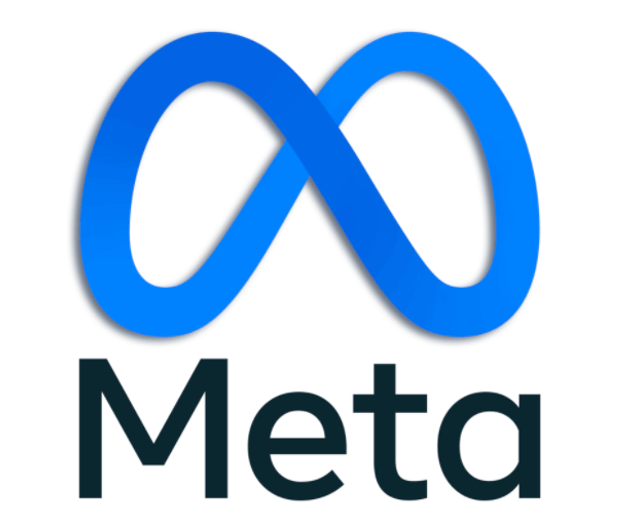
The idea of the “metaverse” was introduced in Snow Crash, a 1992 novel by Neal Stephensen whose characters choose to live in a virtual world because the real one has become unliveable. In a way, Facebook’s corporate rebrand to ‘Meta’ itself hints at this shift; the brand has had to find new territory, because its original form holds too many legally fraught & destructive connotations. The corporate brand’s new name and logo is rich in meanings. According to Meta’s design team, “It can resemble an M for “Meta,” and also at times an infinity sign, symbolizing infinite horizons in the metaverse.” This article explores 3 key meanings underpinning the Meta logo in the context of Facebook’s turn to those infinite horizons.
- Constantly Evolving
According to Zuckerberg, Facebook chose the name ‘Meta’ because of its connection to the Greek ‘beyond’. This notion of going ‘beyond’ has become increasingly popular across categories (e.g. ‘Beyond’ Meat; Impossible Foods), suggesting a resolute reach into the future, and a way of making tomorrow happen now. On the other hand, the logo’s visual evocation of the Mobius Strip, or infinity loop, suggests a chain of events that constantly reinforce themselves through a feedback loop.
Many have noted that logomarks resembling the infinity loop have had their time. Bill Gardner has observed that the continuous loop trend gave logos a sense of movement and agility, their pliable soft edges coding their brands as equally flexible and evolving. They also have a weightlessness to them, abstracted as floating forms connected to nothing but themselves.
Meta’s ‘M’ has a kind of gravitational heaviness that appears to weigh down its potential levity. However, the logo’s weightiness and positioning on a horizontal line, combined with its gently flowing curves, all position the “metaverse” as a welcoming, softened place, both constant and reliable yet dynamic.
- Renewal
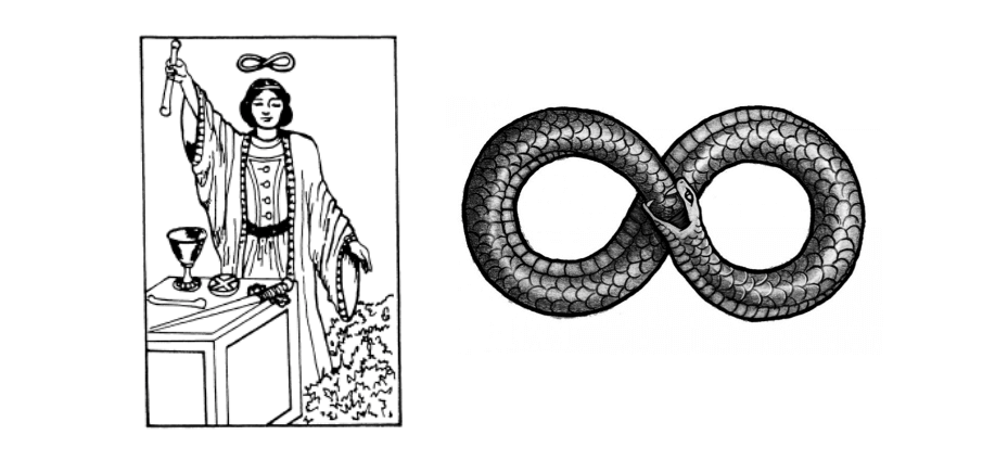 As a symbol, the infinity loop is said to have its origins in the Ouroboros, the image of a serpent biting its own tail. The Ouroboros symbolises immortality and endless destruction and recreation, with the serpent continuously devouring and recreating itself. Many ‘recycle’ arrow icons use a similarly inspired visual to communicate renewal and regeneration.
Facebook has perhaps not intended to portray itself as the serpent that continually destroys itself only to be eternally reborn, destroyed and reborn again – but the associations are relevant in the context of data, tech and obsolescence. Moreover, Meta’s ouroboros seems to represent a world of seamless transitions (e.g. from ‘real’ to ‘virtual’) and smooth forwards-movement (e.g. away from the intense scrutiny and ethical issues currently associated with Facebook).
- Technical Modernity
Clean, simple lines have been used by innumerable logos moving toward contemporary minimalism, from Airbnb to Mastercard. The Meta logo holds some distinction, in that it is designed to ‘live’ in 3D, suggesting that animated logo icons themselves represent the ‘beyond’ in logo design.
As with the original Facebook colour palette, shades of blue signal calm optimism – e.g. blue skies and horizon lines – aligning the brand with limitless opportunity. Blue is also a highly functional colour, shared across the LinkedIn, BMW, and IBM logos. Combined with the grey of the logotype, the colour palette suggests technical rigour and formal efficiency.
Adding to that, the curved line embodies a Lissajous Curve, signalling both a harmonious pattern and a high-tech hardware associated with sci-fi. The logo is fundamentally impersonal, perhaps aspiring to be reassuringly so, suggesting a platform operating ‘beyond’ human error.
Whereas Facebook’s previous logos have been letter based, ‘Meta’ moves the brand’s identity into the visual & 3D, embodying the company’s strategic evolution beyond the flat screen and into an immersive realm. The logo borrows tropes from sci-fi, mathematics, and myth to position the brand itself as transcending categories and expectations. However, its limitation to well-worn motifs and cues of infinitude might well not be enough to suggest that Facebook/Meta is really representative of anything other than unfortunate repetition and self-contained logic.
Katrina Russell, Associate Director