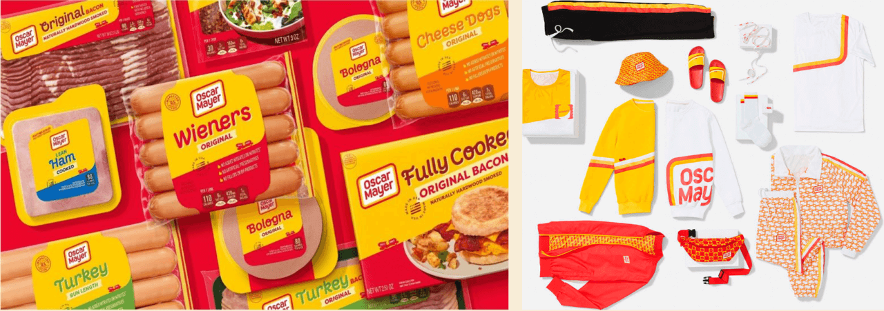
Case Study: Oscar Mayer
How do you champion meat consumption in an emergent way?
The challenge
Oscar Mayer was keen to identify how they could unapologetically champion meat consumption in a culturally emergent way, and leverage the heritage of and nostalgia for their brand. They also wished to identify ways to develop a common Masterbrand identity across their three currently distinct propositions whilst allowing each to retain a strong, individual identity.
What did we do?
We conducted a semiotic analysis of the cultural context of meat in the US (including cultural codes specific to prepared meat), followed by a category analysis of Oscar Mayer’s competitors.
Having fed in creative guidelines, we then analysed the brand’s three design routes propositions, exploring the unique codes they conveyed as well as their alignment with the dominant and emergent codes identified in the previous stages.
Where did it lead?
We identified an overall narrative shift from meat as the simple savoury heart of a meal, but of unknown mass- produced origin, to an authentic food, rooted in traditions, with a sweeter overall flavour profile.
We also identified several tensions within the brand itself as communicated by its key assets, for instance the range offered variety and abundance BUT this variety resulted in inconsistency and an unclear role for the Masterbrand – was it leading and defining, or playing a supporting role to products? Was Oscar Mayer Masterbrand making clear use of its Vintage Americana heritage in a way which linked to a clear product benefit?
Finally, we made recommendations for what codes and cues to discard, dial-up, retain, and import for the Masterbrand, across the ranges (inc. ‘Natural’ & ‘Deli Fresh’), and how to overcome tensions across the brand architecture.
This ultimately led to the successful and award-winning rebranding of the entire Oscar Mayer range, which was relaunched in 2021 and even accompanied by a range of streetwear.