Our Thoughts
Bless You! Sneeze Semiotics
Consider yourself lucky if you’ve never been forced into a pharmacy in search of allergy relief. Nose-running, eyes-watering, desperately searching for anything that will help alleviate your symptoms; from nasal sprays to non-drowsy tablets, to balms and complicated-looking sinus cleansers. With potentially 30% of the global population affected by allergies, over-the-counter medicines targeting allergies and hay-fever are a hot business. Here’s a semiotician’s take on what is going on in the category.
- Dynamic Urgency
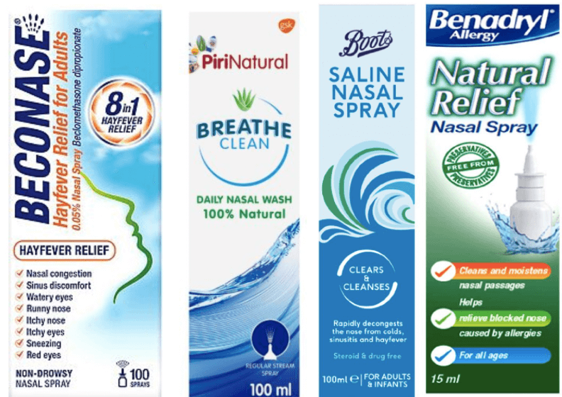
To those of us suffering from allergies, it comes as no surprise that urgency is one of the key messages communicated on allergy medication. Brands like Boots, Piri, and Benadryl rely on dynamic imagery depicting clouds of spray, curling waves, and droplets in motion, communicating action and speed of treatment. This focus on rapidity of relief is mirrored in the linguistic communications on pack: ‘Fast acting, targeted relief’, and ‘Rapidly decongests’, as well as more specific assurances: ‘Works in minutes, lasts up to 10 hours’, ‘Gets to work in 3 minutes’, and ‘Proven efficacy: decongests in just a few minutes.’ These pledges – as well as the kinetic visuals of waves and spray – not only give an impression of the material reality of the product once unboxed but push the idea of a medication that has active and immediate effect, each product vying on shelf to communicate the quickest relief.
- Aggravating Irritants vs Soothing Relief
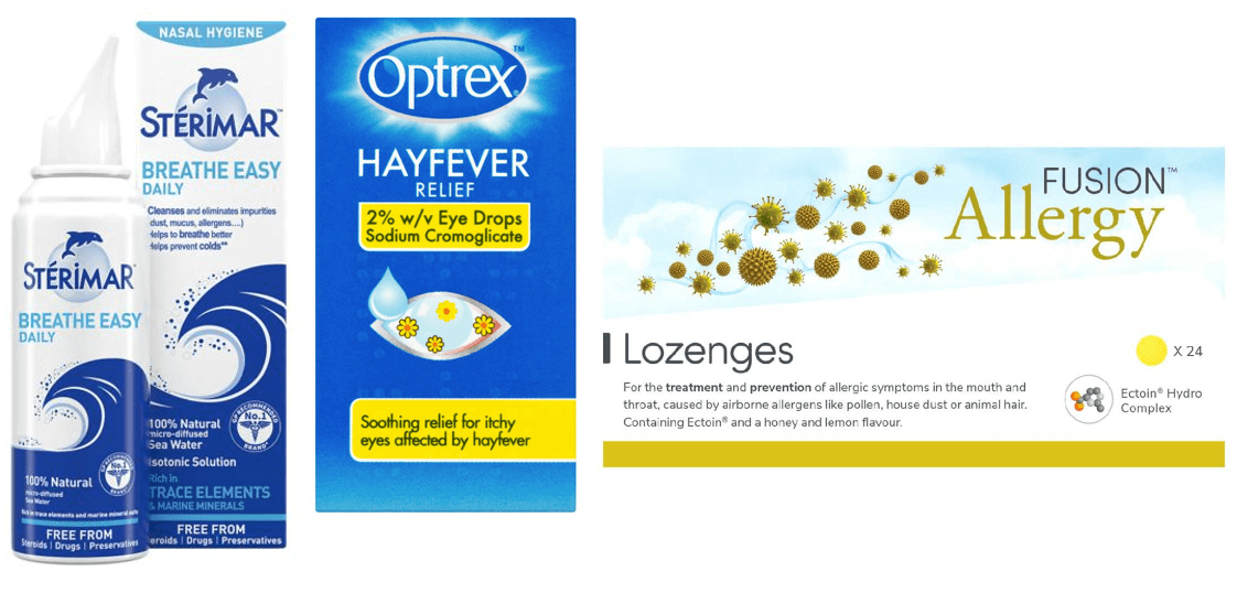
On many allergy products we see allergens displayed front and centre, all the better for the ‘Aha!’ moment upon arrival in the pharmacy, eyes streaming, where it’s possible to immediately identify the product needed from the images on shelf of pollen, flowers, grass – or worse, cats and dogs. Boots own brand features a large white daisy; Benadryl; a sunflower. Piriton includes a flower with each petal displaying a different allergen, and Fusion Allergy comes awash with enough magnified pollen grains to make any hay-fever sufferers bite their nails in fear. By using scientific-style imagery of pollen grains viewed as if under a microscope, Fusion Allergy put themselves forth as a medicalised solution to a medical problem. In displaying the irritants behind itchy eyes and runny noses on front of pack, brands allow ease of identification for allergy sufferers. At the same time, the presence of water in motion on many packs, as well as the use of various blues (see BecoDefence, Optrex, and Stérimar) also creates a sense of deep cleanliness and of washing away irritants – appealing to any allergy sufferers’ sense of relief. On some allergy medication, we see irritants and relief imagery existing at the same time – on PiriNatural, and on Optrex Hayfever Relief, which features an eye full of pollen, as well as a droplet of hay-fever relief just above it. Here, the message is about soothing, cleansing; about medication that can challenge and banish your allergens head-on.
- Simple Naturality
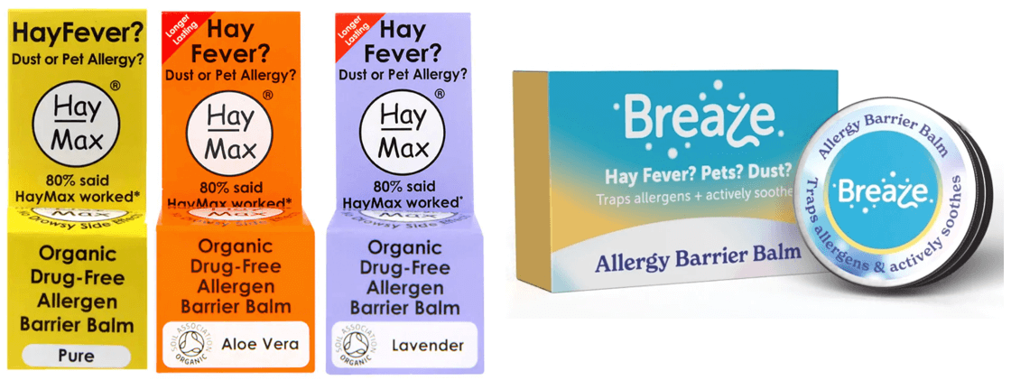
Another approach to allergies comes in the form of natural barrier balms that offer defence against the onset of allergy symptoms. Hay Max and more emergent brands like Breaze offer balms made of beeswax and seed oils, combined with essential oils with anti-inflammatory and antihistamine properties, that appeal to the more environmentally conscious, drug-avoidant customer. Hay Max in particular places emphasis on words like ‘Organic’ and ‘Drug-Free’ on front of pack, and both Hay Max and Breaze are visually more minimal, yet colourful and creative (hand-written style fonts, colours less associated with pharmaceuticals), marking themselves out as unique offerings.
3 key takeouts for brands:
- Dial up the urgency: visuals and language that add a sense of speed, efficiency, and efficacy.
- Create moments of tension and relief on pack: allergens and cleansing waters can be displayed together to create a narrative of successful treatment from stubborn symptoms.
- Focus on simplicity: if your offering is more natural, keep visuals and language simple and paired-back, and avoid over-medicalising. Simplicity is more approachable.
Freya Ward-Lowery, Semiotician