Case Study: Co-op Funeralcare
How do you create interest and action
amongst consumers in advance of immediate need?

The challenge
Co-op Funeral Care & Life Planning (FLP) identified a decline in performance relative to the market. There were concerns that the category could be disrupted by newer brands challenging accepted norms, in light of evolving cultural attitudes.
Co-op FLP sought to re-imagine the brand’s customer proposition and develop its offerings, to align with new customer needs, attitudes, and motivations – whilst ensuring the brand remained relevant to its core customer base.
Sign Salad – who previously supported Co-op FLP with a similar business objective in 2013 – was approached to review its existing semiotic report on the cultural meaning of Funeral Care, Ageing, Death & Grief in the UK, along with an analysis of key (emergent) competitors and the Co-op FLP business unit itself.
What did we do?
We undertook a review of Sign Salad’s previous semiotic report (2013), together with a fresh analysis of Funeral Care, Ageing, Death & Grief in the UK culture (2019), identifying key dominant to emergent shifts.
This was followed by a semiotic analysis of key competitors, ranging from mainstream to leading-edge brands in the Funeral Care and Insurance category. We cross-fertilised our findings from the Cultural Context and Competitor Analysis, identifying 4 future-facing cultural ‘territories’.
Finally, we undertook a semiotic analysis of Co-op FLP, assessing the extent to which the brand aligned with narratives of Funeral Care, Ageing, Death & Grief in the UK.
Where did it lead?
Findings from this study fed into parallel creative ideation workstreams, and offered practical guidance on how Co-op FLP could evolve touchpoints.
We identified ‘Empathetic Embrace’ as an optimal, distinctive space for Co-op to position itself in, providing granular recommendations on how the territory could be brought to life. Within this, we specified the codes/cues that Co-op should retain, dial down and import to communicate in a culturally relevant and future-facing manner, whilst overcoming tensions within the brand.
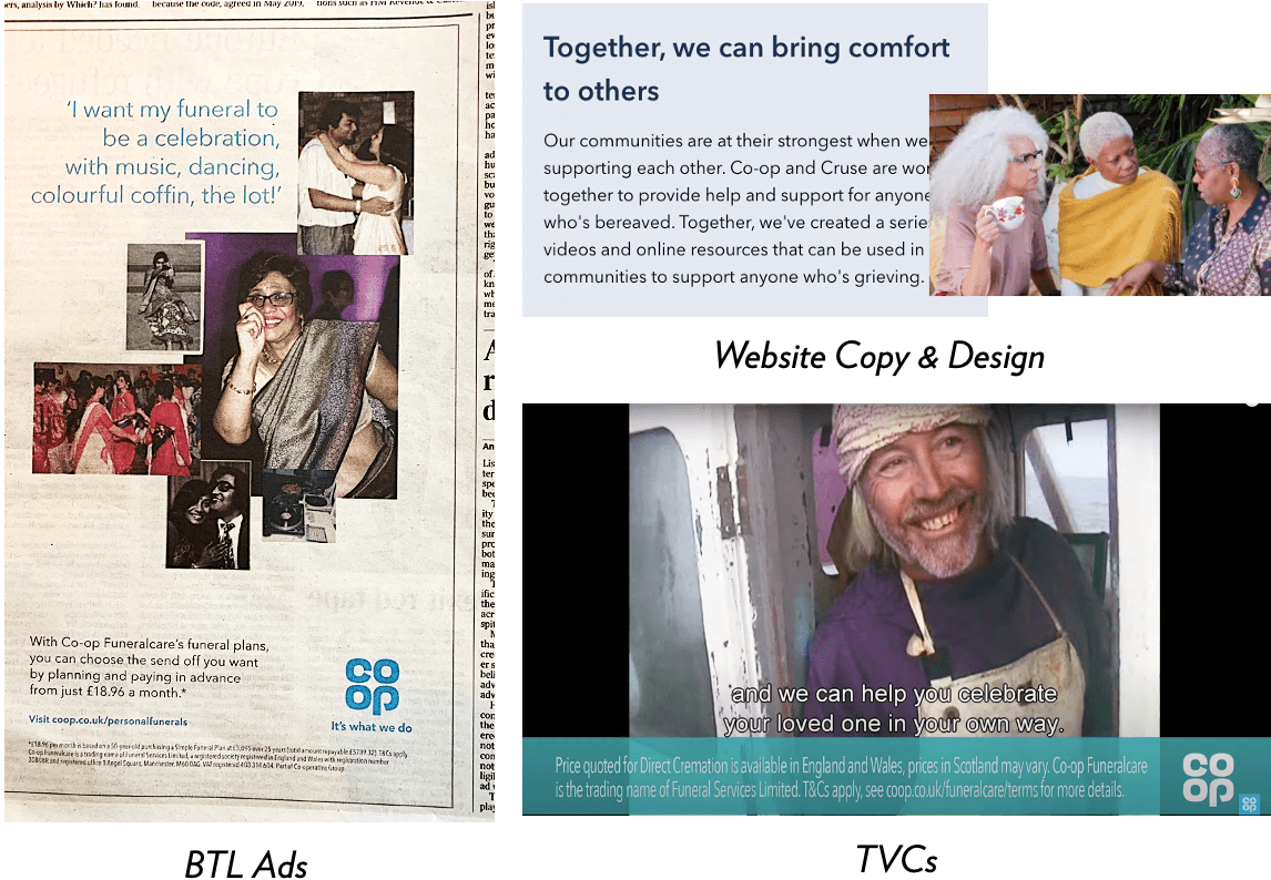
This led to a successful re-articulation of the brand across consumer touchpoints, with a revamp of comms imagery, livery and copy that included a particular focus on greater inclusivity, approachability, and personal touches, as well as a shift away from concepts of death as sombre finality towards death as positive regrowth and renewal.

Case Study: Oscar Mayer
How do you champion meat consumption in an emergent way?
The challenge
Oscar Mayer was keen to identify how they could unapologetically champion meat consumption in a culturally emergent way, and leverage the heritage of and nostalgia for their brand. They also wished to identify ways to develop a common Masterbrand identity across their three currently distinct propositions whilst allowing each to retain a strong, individual identity.
What did we do?
We conducted a semiotic analysis of the cultural context of meat in the US (including cultural codes specific to prepared meat), followed by a category analysis of Oscar Mayer’s competitors.
Having fed in creative guidelines, we then analysed the brand’s three design routes propositions, exploring the unique codes they conveyed as well as their alignment with the dominant and emergent codes identified in the previous stages.
Where did it lead?
We identified an overall narrative shift from meat as the simple savoury heart of a meal, but of unknown mass- produced origin, to an authentic food, rooted in traditions, with a sweeter overall flavour profile.
We also identified several tensions within the brand itself as communicated by its key assets, for instance the range offered variety and abundance BUT this variety resulted in inconsistency and an unclear role for the Masterbrand – was it leading and defining, or playing a supporting role to products? Was Oscar Mayer Masterbrand making clear use of its Vintage Americana heritage in a way which linked to a clear product benefit?
Finally, we made recommendations for what codes and cues to discard, dial-up, retain, and import for the Masterbrand, across the ranges (inc. ‘Natural’ & ‘Deli Fresh’), and how to overcome tensions across the brand architecture.
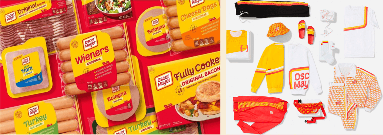
This ultimately led to the successful and award-winning rebranding of the entire Oscar Mayer range, which was relaunched in 2021 and even accompanied by a range of streetwear.

