Our Thoughts
Squirrel This Away Semiotics of the Nut Butter Boom
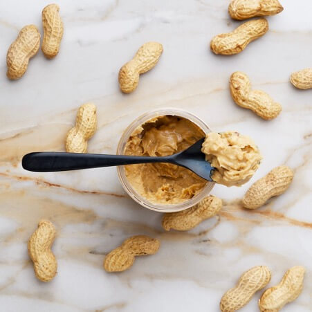
With National Toast day fast approaching, the question on everybody’s lips surely is: what to spread on it? Nut butter seems to be one to watch, having overtaken sales of jam in 2020 according to The Grocer. Research and Markets also cites a 163% growth in nut and seed butters over the Coronavirus pandemic, attributing the rise in popularity to Covid-driven increased demand for shelf-stable products to stock up on as well as fitting in with the wider rise of plant-based eating.
And with a category that has exploded in the past few years – transforming from children-focused cupboard staple to high-flying health food – comes a plethora of ways to code the product. Let’s take a look at some pack designs that highlight 3 of the different semiotic directions within the category.
- Wholesomely Natural
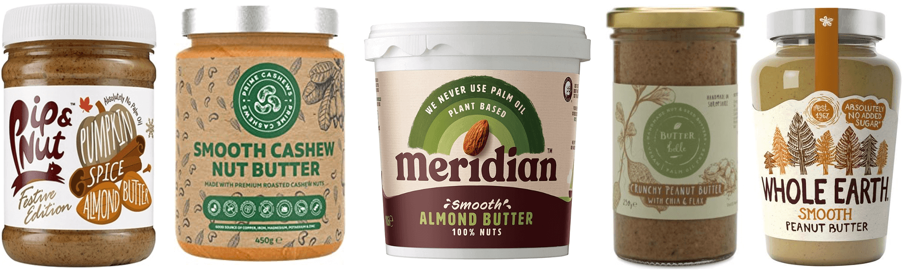
With brands like Meridian, Whole Earth and Pip & Nut part of nut butter’s transformation into a product associated with minimally-processed goodness and natural health benefits now seen on supermarket shelves, this space represents the new familiar face of nut butter. Many brands even offer bulk tubs (see Meridian 1kg above), which just goes to show how natural nut butter has become an essential for some.
Earthy tones – especially greens and browns – alongside more natural textures like matt paper labels provide a visual link to the product’s plant origins and align with wider conventions for visually cueing sustainability. Meanwhile, hand-drawn illustration and font styles code the inevitable human involvement in making the product as careful and attentive.
Explicit references to the physical planet (“Whole Earth”, “Meridian”) and foregrounding of sustainability propositions (e.g. absence of palm oil) alongside health claims (e.g. no added sugar) code these nut butters as part of a mutually beneficial relationship of holistic care between people and planet.
2. Gourmet Sophistication
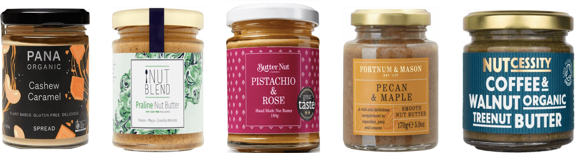
Meanwhile, some nut butter brands have turned this pantry staple into something of a foodie experience.
Packaging in this space uses bright but complex colours (tertiary hues like Butter Nut’s magenta-beetroot or Nutcessity’s deep teal) to mirror complex tastes and combinations. The flavours themselves frequently allude to tried-and-tested but special delicacies like praline or recognisably upmarket pairings like pistachio and rose, coding these nut butters as a fine food treat.
These spreads also often come in daintier pot sizes, coding what’s inside as a precious commodity to be savoured. This sense of preciosness is reflected in the decorative elements too: be they delicate patterns or abstract designs, artful but polished visuals position the product as an object of aesthetic desire.
3. Creative Play
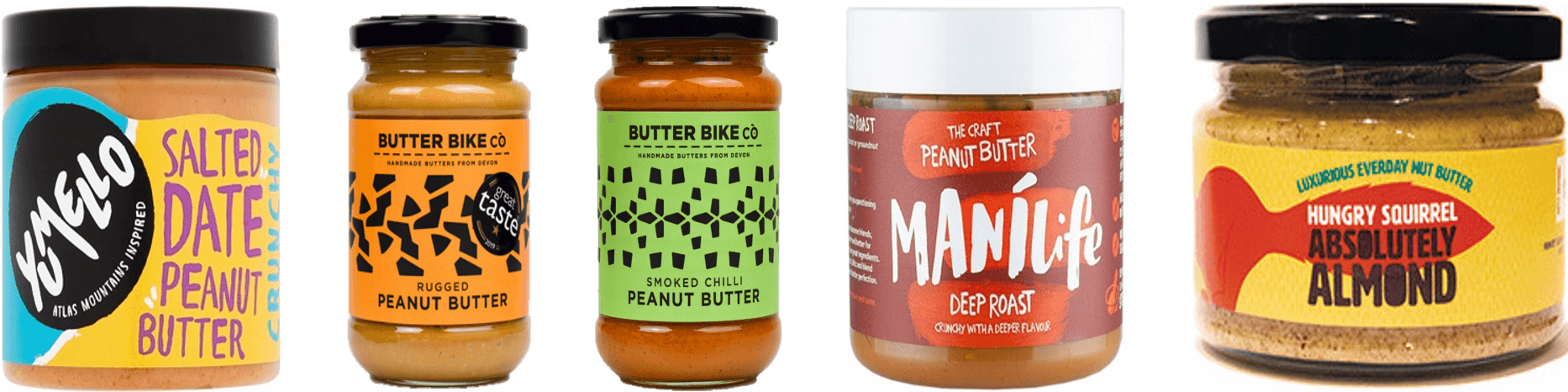
In this colouful space, craft is expressed as bold creativity, with nut butter embodying emergent food narratives of joyful healthiness.
Tub-like wide-mouthed containers stand out from the conventional jars of the category and connote simple, bold impact through their blocky design, coding an inventive product with full-on flavour. Craft is clearly communicated (see Manilife, where this is mentioned front and centre, or Butter Bike “handmade butters from Devon”), but in a way that diverges from dominant narratives of painstaking care and traditional knowledge. Bright hues with rough colour blocking, cut-out designs or prominent repeating patterns alongside uneven scribbly fonts, use of all caps and suggestions of fast movement (“bike”, “squirrel”) code craft as passionate expressiveness here.
Some more complex varieties are present in this space too, and might be less familiar (at least in a UK market; Yumello for instance take inspiration from Berber culture in the Atlas Mountains). Nevertheless, ingredient lists remain pared back – this is still natural nut butter, after all – coding the product as a joyful means of sensory exploration that also happens to be good for you.
Key takeouts for brands:
- Pack design can often be customers’ first interaction with a brand – for example when browsing instore – and in this context will likely appear in dialogue with others in the category. Where does your brand fit in this visual landscape?
- Design elements carry cultural meaning both individually and together. Are all elements of your design (e.g. pack shape, size, materials, texture, colour, visuals, typography, language…) contributing to the desired coding of your product, or could there be tensions?
- In the case of nut butter, rapid expansion in the category has been the result of consumers’ changing circumstances in combination with cultural shifts. Being attentive to how your product is coding and aligning with cultural change ensures long-standing relevance.
Sophia Lucena Phillips, Semiotician