Our Thoughts
Wine o’clock however you want The new visual language of canned wines
Perfectly suited to outdoor summer socialising, as well as for increasingly environmentally concerned consumers, canned wine options are now proliferating in the drink aisles. In the past, canned wine has often been seen as a low-quality, cheap but convenient alternative to the more classic and premium option – a glass bottle of wine. While the use of slim tins provides a more elegant appearance to the pack as compared with tins of soda or beer, the pack format and material itself, associated with such commodity products and drinks purchased in the supermarket cooler aisle has typically undermined any claims to a premium product inside. Increasingly however, canned wine brands are utilising a distinct visual language to separate their products from both conventional bottled and boxed wine, allowing for a new perspective on the occasions for, and premiumness of, tinned wine and giving it a new emotional appeal.
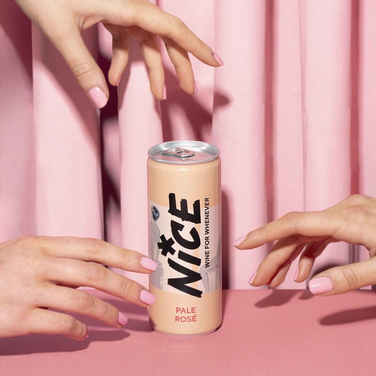
Some brands, such as Nice and Hun, have both adopted the warm, uplifting pastel hues commonly seen used in millennial-oriented self-care and beauty packaging, communicating an uplifting experience for everyday enjoyment and positivity. Nice’s brandmark, written in a style appearing rapidly, casually written in broad brushstrokes, alongside lo-fi casual black and white snapshots of casual social occasions connote imagery often used by street- and skate-wear brands, creating a space for a historically formal, ‘serious’ drink in a wider range of social settings and occasions (and why not a rosé at the skate park?). At the same time, Hun’s minimal, monochrome pack design with lettering that tumbles unevenly brings to mind drinks outside the wine category, created for adult relaxation and wellness (such as Trip CBD), but with a playful, energetic twist suggesting an uplifting wine to be enjoyed day or evening.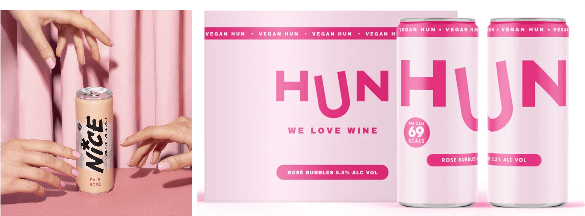
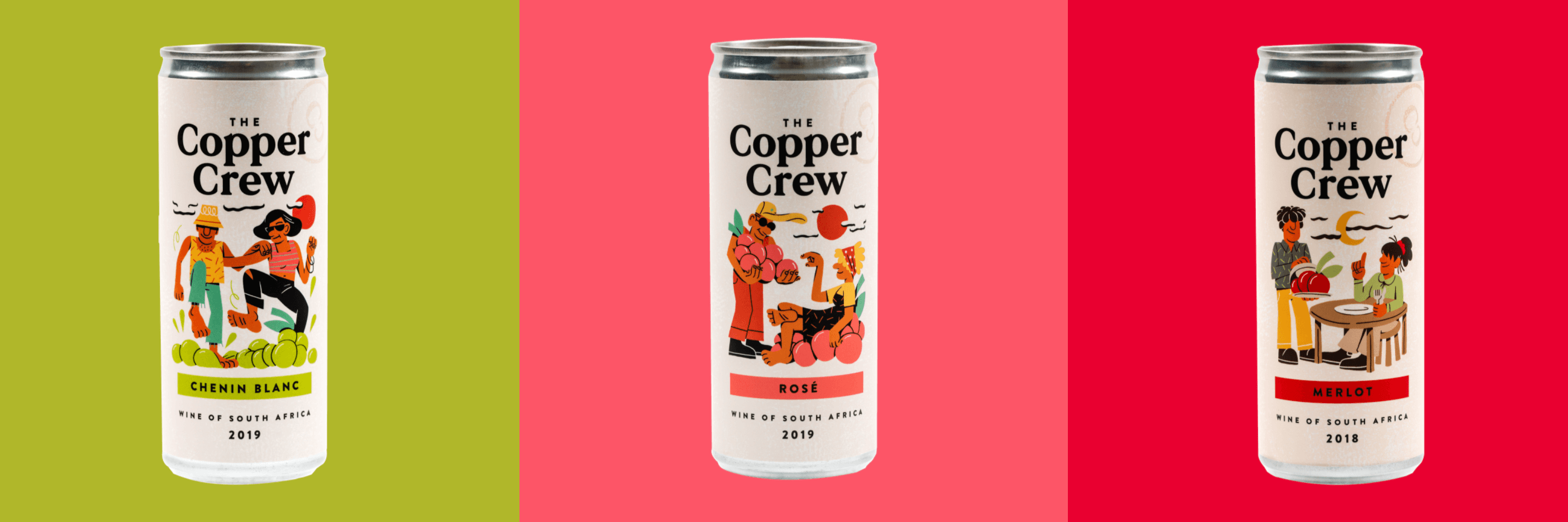
Likewise the brand Copper Crew uses similarly playful illustration styles, with simply rendered, flatly saturated coloured illustrations of cheerful figures set amongst cartoonishly-large bunches of grapes which connote the wry humour of classic comic-strips to communicate an adult sense of playfulness and wit. These visuals support its claim of being wine that’s “not for the cellar, for everywhere else.” And the short, slang-like informality of both Nice and Hun’s brand names further communicates a product for relaxed enjoyment of social occasions – something to be casually shared with friends without pretence to connoisseurship or the elevated formality of traditional wine appreciation. As Nice’s pack says, it’s “wine for whenever.” This connotation is a strong departure from traditional, formal, and self-consciously elegant branding often found on conventional bottled wines, and places Nice as a stylish, modern wine for a generation who is fashion-forward but eschews formality and the traditional trappings of exclusivity.
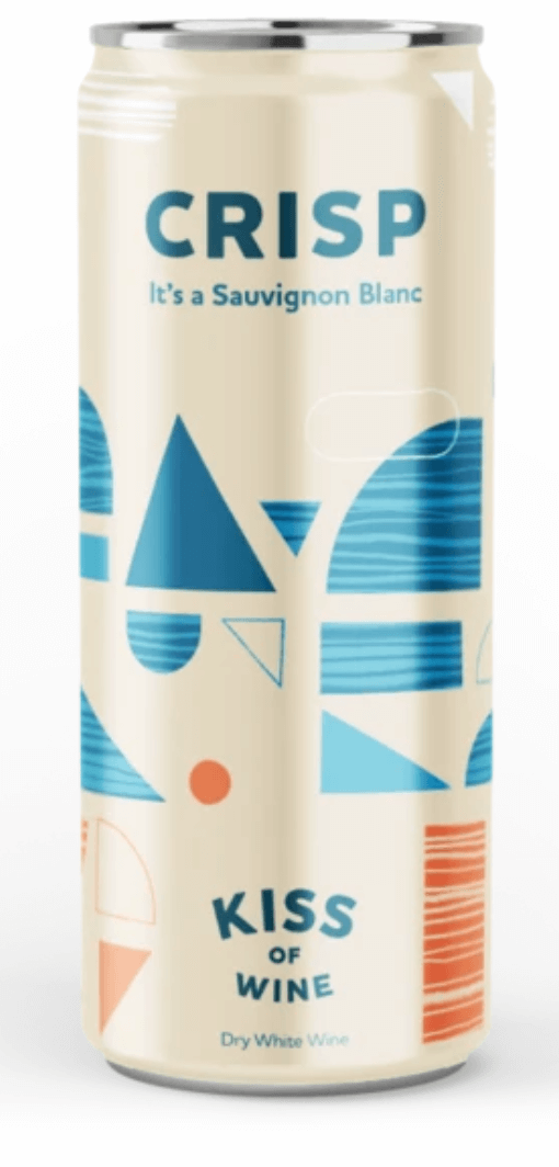
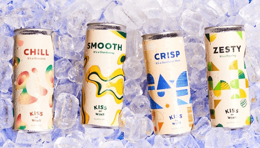
Alternatively, brands Private Beach & Kiss of Wine both embrace the fonts and visual styles of an early- to mid-20th-century seaside aesthetic. Kiss of Wine’s “Crisp” Sauvignon Blanc, for example, employs a minimalist aesthetic similar to Hun, but with a geometric graphic pattern reminiscent of mid-century modern textiles and wallpapers. These geometric shapes filled with an abstract pattern suggestive of seaside waves touched by a sunset, suggesting a stylish summer refreshment of a Mad Men era barbecue.
Private Beach, as is fitting with the name, uses imagery and an illustration style that draws on vintage Mediterranean holiday posters, with an art deco sans serif font and the sleek lines and solid colours of early 20th century prints, the wide blue sky, swimcap wearing figure and red-and-white striped umbrella suggests a nostalgic, worry free summer holiday.
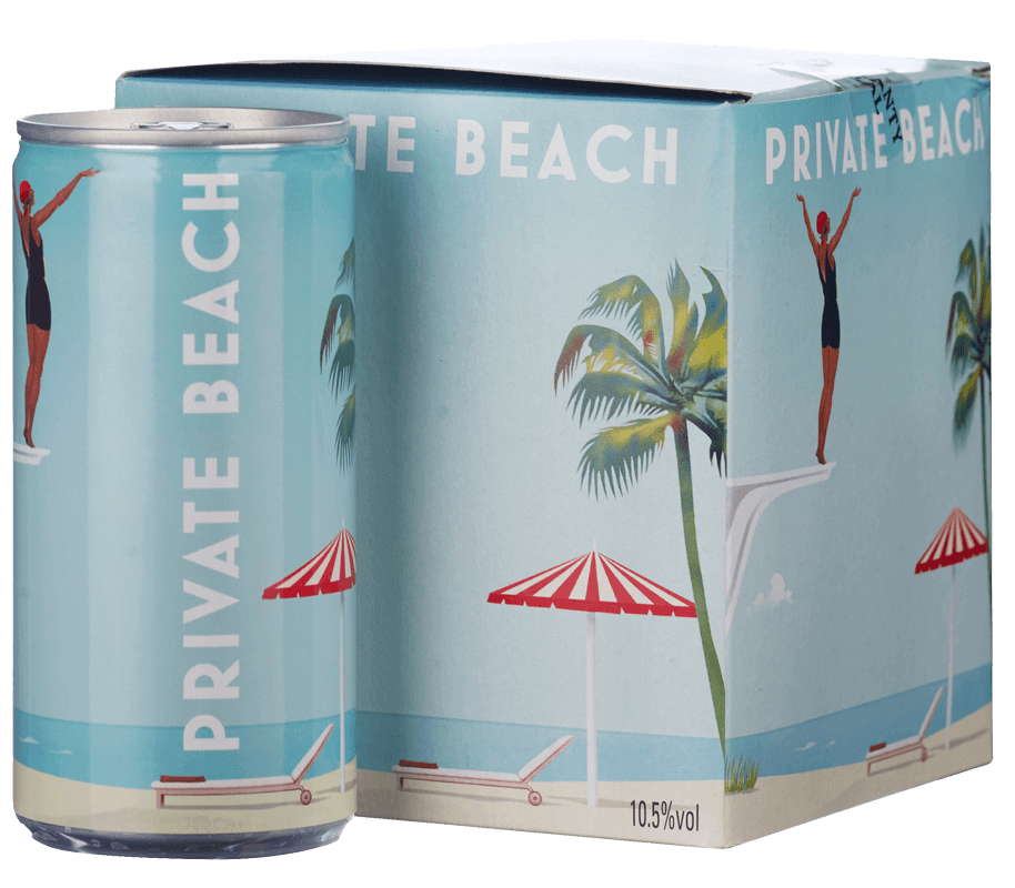
In both cases these visual designs communicate a drink that is both refreshing for summer drinking and transportive to a seaside retreat in a mythologised worry-free past, even if only part of a picnic in the local park. While using a different route, these canned wines are again made for uplifting enjoyment without the need even to worry about glasses or resealing a bottle, rather than formal sophistication requiring the rules of certain occasions, locations, and glassware to enjoy.
Finally, there are some brands who take a more maximalist approach, with abstract artistic styles more similar to the unique imagery seen on bottled natural wines. The Canned Wine Co. offers a range of varietals packaged in unique, colourfully abstract patterns of swirling paint, with each labelled as a number (such as Garancha as “No. 5”), subtly reinforcing an association with expressive, interpretive modern art (i.e. Jackson Pollock’s painting “No. 5”).
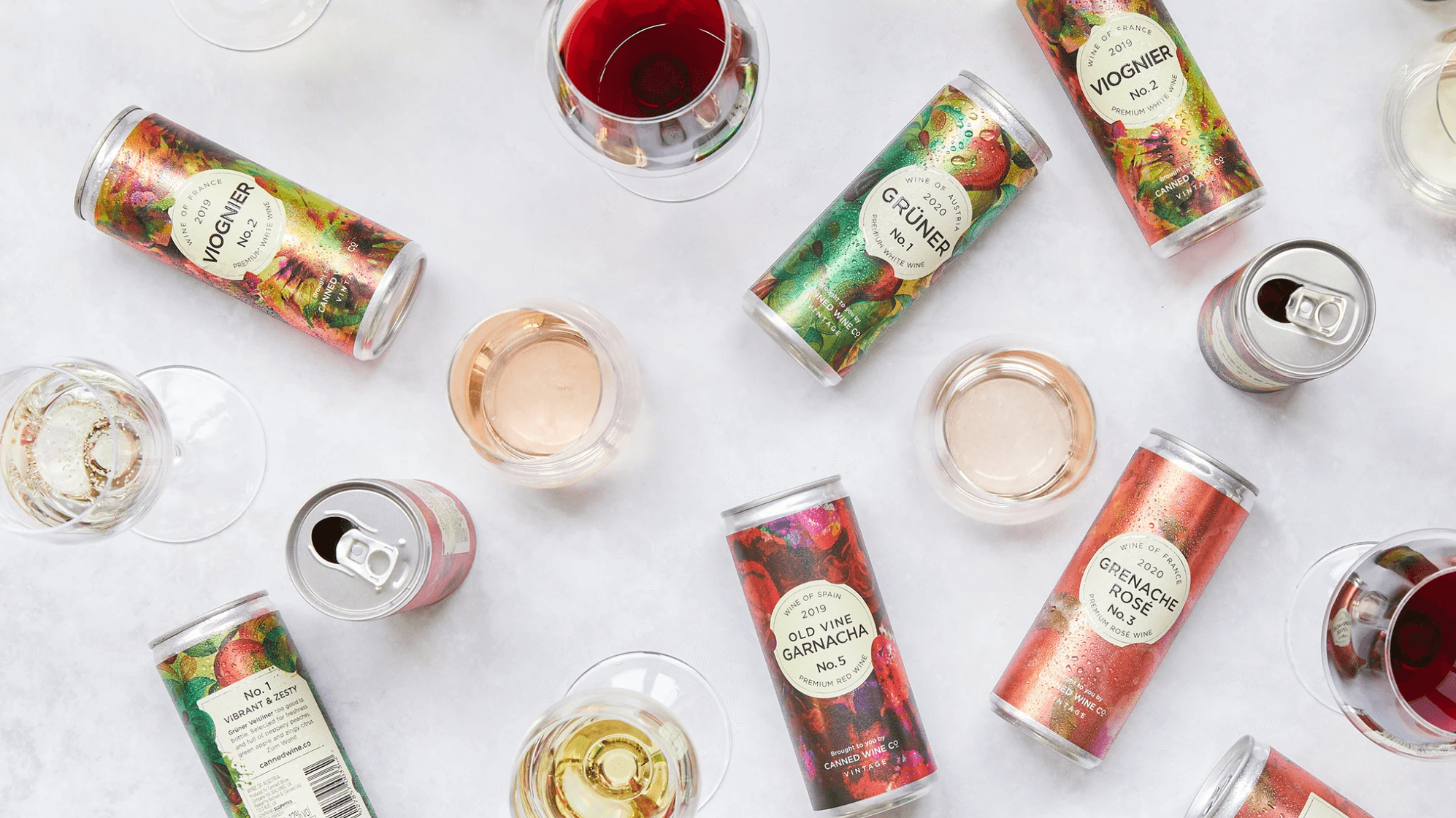
Some of Kiss of Wine’s packs, such as its “Zesty” Reisling, use the same mid-century abstract patterns to subtly communicate flavour qualities through colour and wine quality, while maintaining the design-led decorative association. Others have made the museum-quality association more overtly, such as a South African wine named “The Curator” which displays a collage of botanical print imagery suggestive of the disinterested aesthetic consideration of a knowledgeable connoisseur or critic. Ultimately, such brands are using imagery and language connected to art and design to communicate their premiumness and curatorial knowledge, while distinguishing themselves from traditional cues of premium bottled wine and providing a new way to think about enjoying wine.
While we see that there is a wide range of visual styles being used in the growing canned wine category, what they all share in common is addressing a challenge long faced by wines served in anything but a glass bottle: the use of visual and linguistic cues employed by these brands helps to bring the humble aluminium can out of the convenience space and into a premium wine offering. While the appeal of traditional glass wine bottles seems unlikely to wane in the near future, canned wine brands are opening up a space for new ideas about how and when to enjoy wine, and what it means to do so.
3 key takeouts for brands:
- Look beyond your category’s traditions: even in a category with a strong heritage and history such as wine, there is room to play with the occasions and emotions evoked. Looking to adjacent categories (such as seltzers) or even further afield can inspire innovative uses and alignment with lifestyle spaces.
- Experiment with materials and formats: Tinned wine can be as premium as a glass bottle. Whether for convenience or sustainability, materials that have been seen as “cheap” can be adopted in new categories and elevated through thoughtful use of language and visual design.
- Find the opportunity in changing norms: While tinned wine is not new, the changing norms around outdoor socialising and safely individually-sized servings have created an opportunity to innovate and develop new brands in the category. Beyond seasonal socialising, keeping on top of emerging social and cultural changes provides a background for creating relevant product and packaging innovations in the short and long term.
Isobel Grad, Senior Semiotician