Our Thoughts
Very Peri Pantone’s Color of the Year for 2022 through the lens of culture and branding
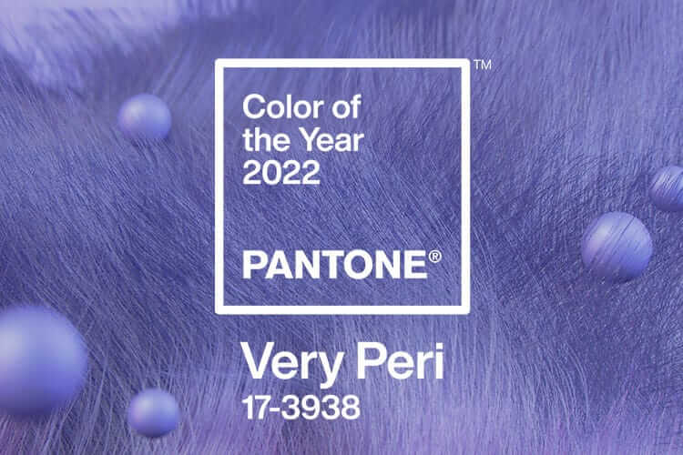
Very Peri was recently announced as Pantone’s Color of the Year for 2022. What can this colour choice tell us about culture now, and Pantone and other brands’ interaction with it?
For the first time, a brand new colour has been created specifically for Color of the Year – it is billed as “A New Pantone Color Whose Courageous Presence Encourages Personal Inventiveness And Creativity”. It has also been noted that Pantone’s chosen hue differs to those chosen by competitors: muted green is coming through quite strongly in many other colour of the year announcements (see Architectural Digest’s roundup here).
Those green tones have overt connotations of calming naturalness and through that, renewal – qualities that Very Peri(winkle) also approaches, but in a different way, bringing us the renewal of innovation. As an outlier in terms of the colour trend and yet market leader, Pantone is positioned as distinctive visionary, leading by example when it comes to courageous presence encouraging inventiveness and creativity.
Very Peri’s colour makeup – blue (traditionally associated with tranquil stability) with red undertones (seen as high-energy forcefulness) mixes cool with warm and brings together colour connotations usually regarded as in opposition to each other. This mixture is described by Pantone as bringing “a novel perspective and vision of the trusted and beloved blue color family… and yet at the same time with its violet red undertone… a spritely, joyous attitude and dynamic presence that encourages courageous creativity and imaginative expressions”.
The tone sits somewhere between red and blue on the colour wheel – somewhere between the fixed quantities of the two primary colours – but bringing together elements of each. Thus formulated, Very Peri embodies a state of myriad simultaneous possibilities – apt for an ongoing cultural move towards multiplicity and the deconstruction of externally dictated boundaries. Further, as a tertiary colour, it carries connotations of complexity. Brands often leverage this colour symbolism, for example using tertiary colours to signal nuanced flavour. Very Peri, then, stands for multiple possibilities of complex richness.
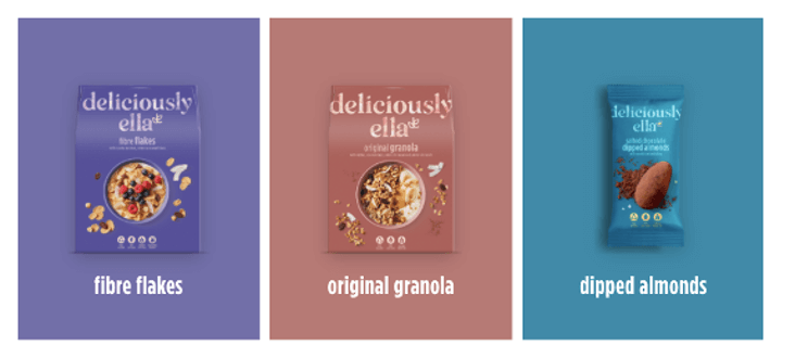 Deliciously Ella uses tertiary colours to connote complexity of taste, including a shade of periwinkle
The fact that you can’t pin Very Peri down doesn’t stop at the makeup of the colour itself, however. While Pantone themselves refer to it as blue, in the response to it there has not been a consensus. For instance, Dezeen have pointed out that many would call it purple and have written about it as such here.
Like blue, soft purple tones are often associated with serenity (e.g. lavender and its famously calming scent). What is more, they are traditionally symbolic of spirituality, with echoes of mystery, otherworldliness, and imagination. The aura of tranquillity and dreaminess conferred by both purple and blue have led to their extensive use to signify restful sleep and relaxation – more dominantly, by tea and sleep aid brands, and more emergently, in newer categories such as relaxation drinks and sometimes for CBD products.
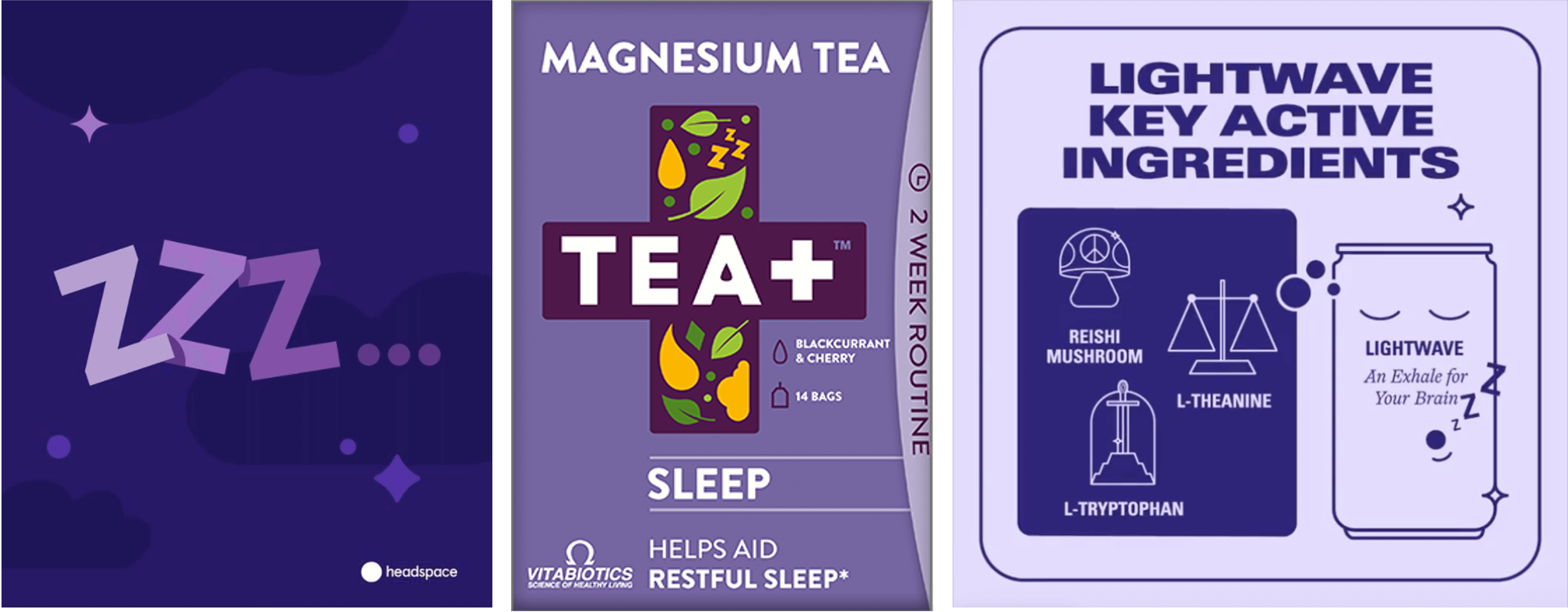 Headspace, Vitabiotics, Kin Euphorics
The colour has also carried connotations of royalty – all the way from ancient times when hard-to-make purple dyes could only be worn by the most privileged, to The Artist Formerly Known As Prince. Dominantly, brands leverage these connotations of regal magic to code rich, joyful ritual with dark purples (Cadbury’s, Hallmark).
More emergently, we can see brands, often in personal care and adjacent spaces and largely targeting millennials, using palettes of complex pastel tones including purples. Often reiterations of familiar objects, these products promise market-disrupting simple effectiveness coupled with aesthetic desirability. Here they can be seen to draw on the regal power of purple tones to position themselves a cut above the rest, but with the subtlety conferred by the softness of periwinkle tones.
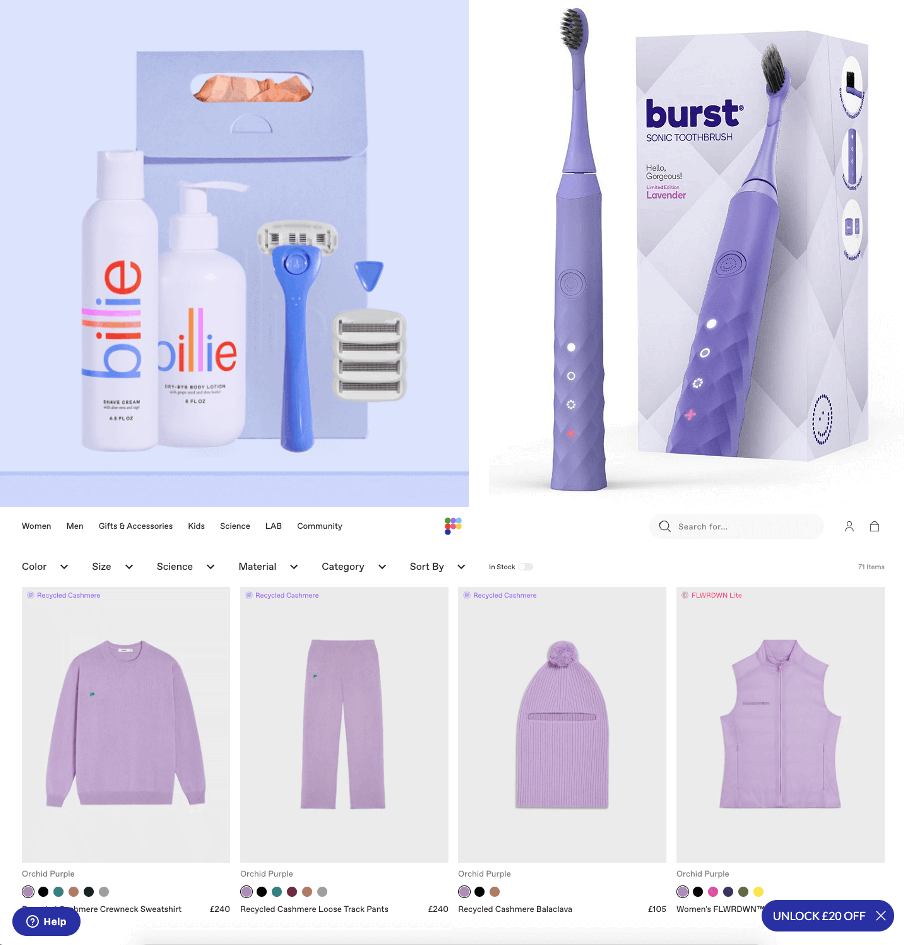 Clockwise: Billie, Burst, Pangaia
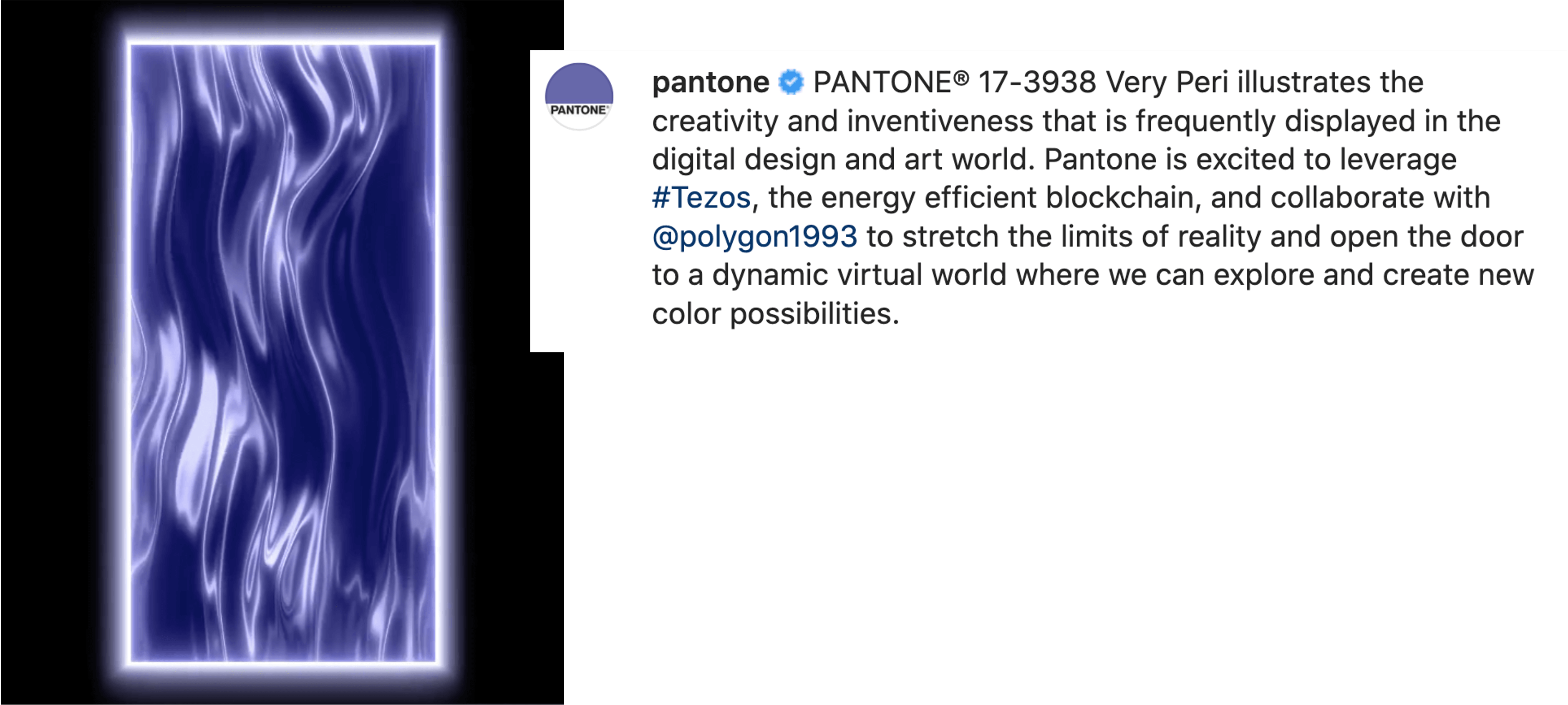
A final aspect to the blended nature of Very Peri is the space it represents. Again as Pantone themselves say, “our physical and digital lives have merged in new ways” – and Very Peri is a visual reflection of this. Named after a flower, PANTONE 17-3938 is nonetheless an unusual hue to find in the natural world (see the history of purple dye), connoting complex, skilled artifice. The visuals created by Pantone to display the tone embody this duality: a dreamlike, transparently digital render art style with quasi-natural forms (abstract hair-like fronds, perfect spheres floating like bubbles), bringing together organic movement with digital non-space.
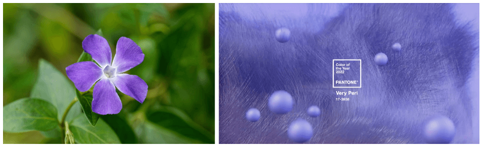 A periwinkle; a still from Pantone’s digital render displaying Very Peri
Tapping into something that we’ve seen happening with emergent brands (e.g. Recess, with their creation of a dreamlike digital product realm – read our article on relaxation drinks here), Pantone makes the most of the imaginative potential of a metaverse reality. The visuals take this fusion of the digitised and the “real” – these days, an imperfect space often borne of necessity – and highlight the beauty in it, foregrounding the creativity that has made these spaces possible and celebrating a new blended physical/digital reality as opposed to the latter standing in as awkward replacement.
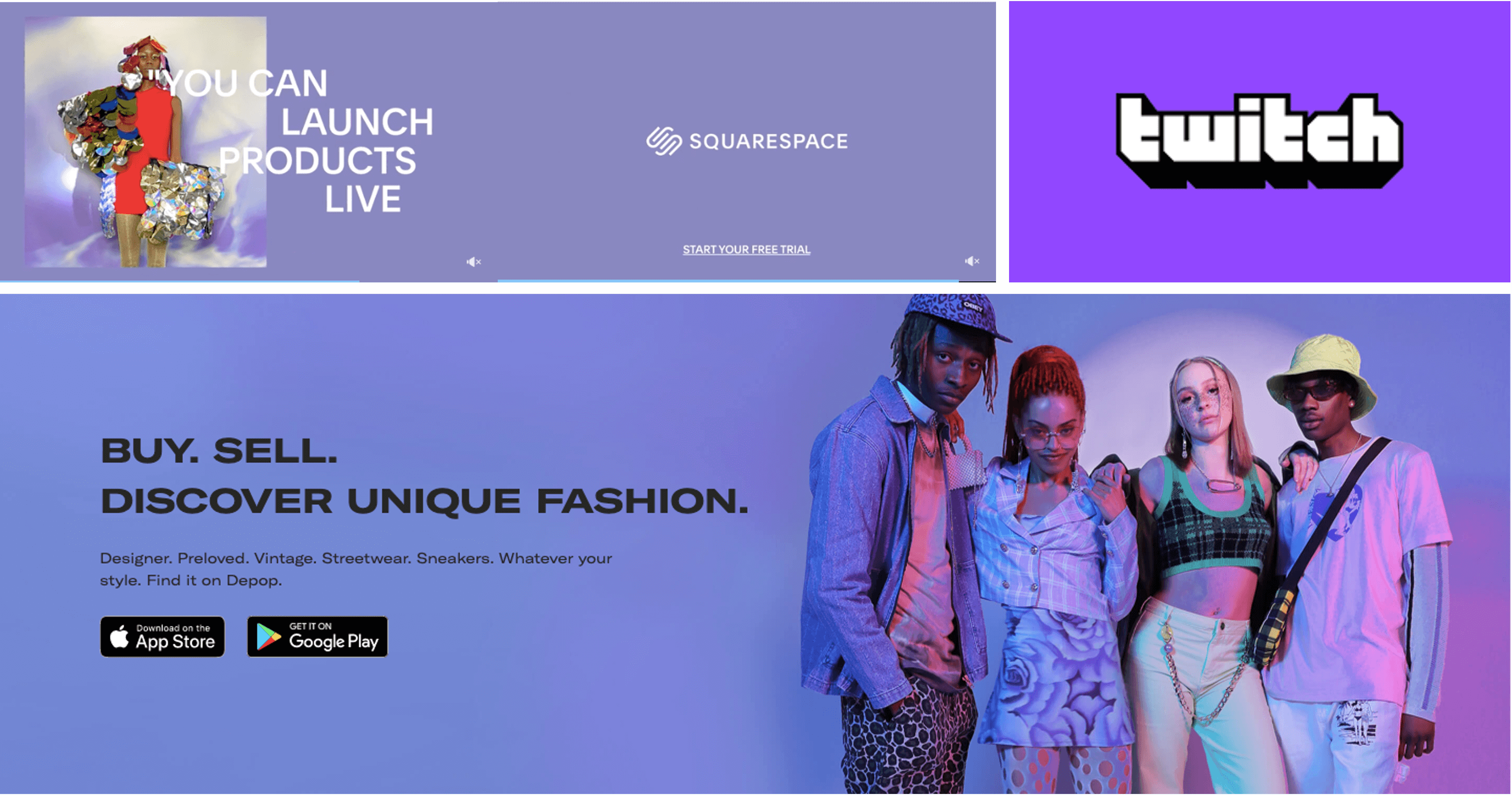 Brands comfortable in (or, in the case of Twitch, foundational to) the metaverse employing periwinkle hues to signal digital creativity and inspiration
Further, Pantone taps into emergent link between the digital realm and boundless, untapped creativity – where previously, art in the mainstream was considered a largely analogue pursuit, the rise of NFTs is prompting a re-evaluation of this link. Pantone lean in to this, featuring digital artists in their social media promotion of Very Peri, and highlighting their use of blockchain Tezos – positioning the colour brand as forward-thinking participant in the new creativity.
3 key take-outs for brands:
- Understand how colour theory can affect the connotations of your design choices – beyond the colours themselves, what does their makeup say?
- Leverage the nuance that variation in shades and tonalities can bring, including as an update to established meanings: dark purple = traditional premiumness; periwinkle = emergently aspirational.
- Tie your use of colour into a wider cultural context – Pantone’s success at embodying new digital creativity with Very Peri is only strengthened by their spotlighting of relevant artists
If you enjoyed this article, please read our previous article on Pantone’s ‘Classic Blue’ here.
Sophia Lucena Phillips, Semiotician