Our Thoughts
Tin Can Magic Sandwich filler to sensory seduction – on the shifting perceptions of tinned fish
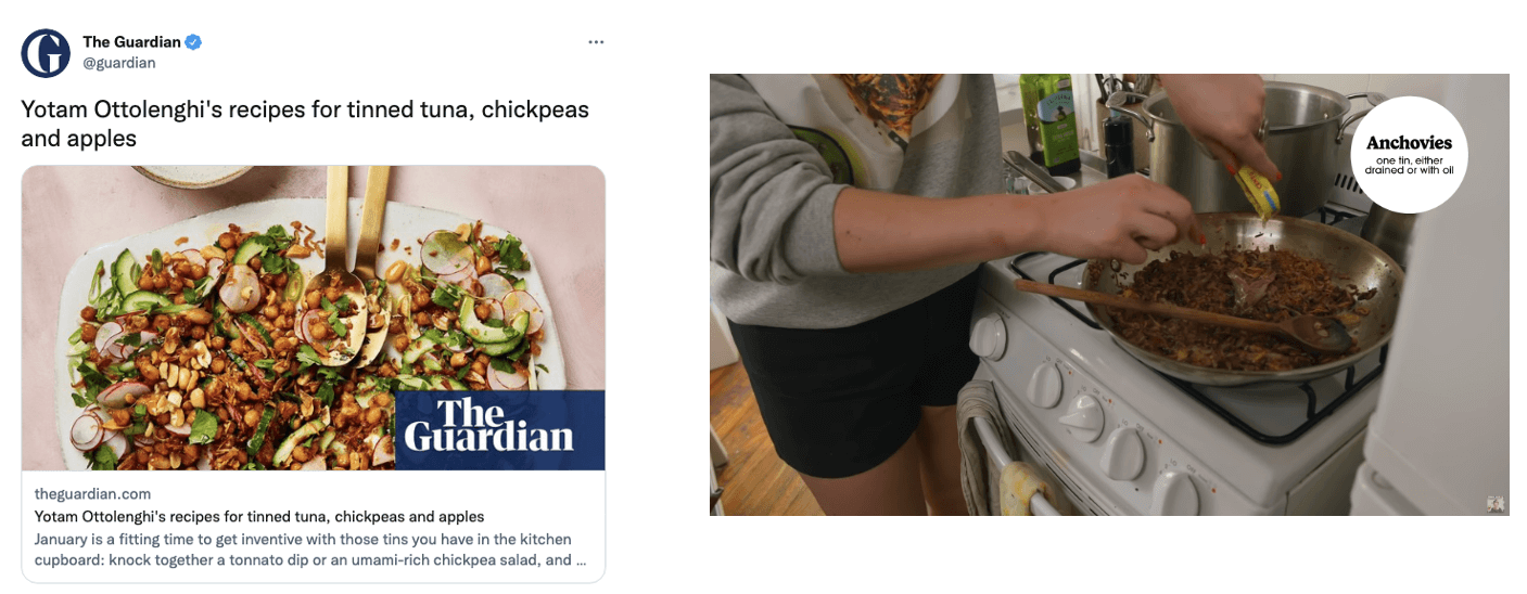
From a quick, protein-packed spread on your morning toast, to an added umami explosion in your weeknight pasta, tinned fish is shedding its reputation as a cheap, smelly sandwich filler, and quickly returning as a posh pantry go-to. In stackable, round-edged, flat metal tins, these canned sea-goods are experiencing a cultural resurgence – sparked by a pandemic-fuelled desire for greater shelf-stable staples and energetically advocated by contemporary chef-fluencers, including Yotam ‘pomegranate molasses’ Ottolenghi and internet’s ‘hot girl’ Alison Roman.

Ottolenghi’s recipes advocate the embrace of shelf-stable staples, while tinned anchovies are the star of Roman’s shallot pasta
Vying for a spot on supermarket and farm shop shelves, tinned fish brands are refreshing their offerings – leaning into several distinct visual languages to communicate their brands’ values in this increasingly sardine-packed category.
Trusted Heritage
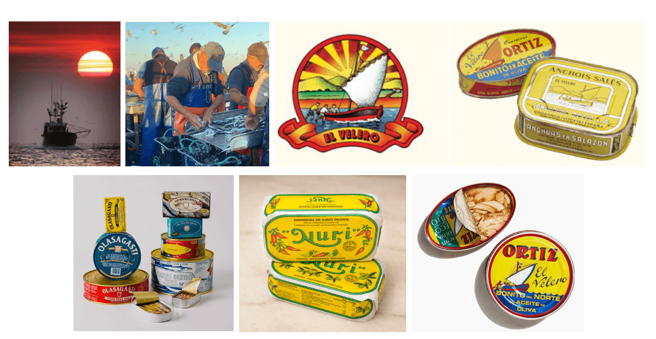
For heritage family conservas (Spanish for ‘something preserved’) Ortiz, the balmy weather of the Basque Coast offers much inspiration. The distinct red and yellow tones on its current packs (retained from its mid-20th century designs) recall the soft morning glow coastal fishermen are greeted with as they work the harbour. Complemented by painterly illustrations and cursive, calligraphic lettering, the design communicates the time-honed artisanship of the Mediterranean conservas. Others, including Olasagasti and Nuri, likewise feature warm, rich hues, also leaning into the Romance languages of their provenance, styled in characterful serif typefaces to accentuate their deep ‘Made in Europe’ tradition. Combined with the aged patina of their tinted gold tins, these packs evoke a nostalgia for the local and long-loved Spanish and Portuguese conservas.

(Clockwise from top-left) The morning glow of the Basque Coast; Conservas Ortiz’s tinned bonitos, past and present; Nuri and Olasagasti
Unfiltered Simplicity
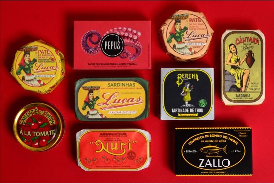
Still, other leading-edge brands are taking a pared-back, fish-first approach, opting for plain and clean pack designs that put their fine catches front and centre. The carefully detailed illustrations on Pyscis’ and Salmon Sisters’ packs are reminiscent of scientific drawings and complemented by social media feeds flooded with sky-lit photography of tessellate-arranged fishes, bringing to life the thoughtful, hand-picked selection that goes behind each can. Moreover, tucked within parchment-wrapped, rubber-banded, and twine-bound tins, the neutral palette and raw materiality align with an ethos of honest simplicity and minimal intervention. And as consumers continue to demand greater transparency and sustainability in their food choices, these brands are opting for a language of care and ethics (“tin-to-table”, “hand-filleted”, “wild caught”), promising respect for the sea that underscores a responsible approach in the sourcing of their fishes.

(Left to Right) Pyscis, Pepus, and Salmon Sisters’ pared-back, fish-first designs underscore the potently fresh sea-goods packed within the tins
Artful Gastronomy
Perhaps the most visually arresting of codes in this category is the kitsch and colourful designs of Fishwife, Jose Gourmet, and Tesco’s Finest range. Touting vibrant, rainbow-hued illustrations and crafty, collage-style graphics, the whimsical designs code these tin offerings as paint and brush, providing a bold palette that inspires creative and flavourful recipes. These brands’ social channels also sport ‘high fashion’ editorial-style photography and framed prints of pack designs, elevating these preserved provisions as edible objets d’art. Yet, with a conversational tone of voice (“your fav friendly tinned seafood co.”, “sweet ‘lil midweek snack”), coupled with rounded ‘hand-drawn’ or textured brushstroke typefaces, these brands shed the stuffiness of traditional premium offerings, demonstrating instead a tongue-in-cheek playfulness which encourages at-home experimentation and a new generation of gourmands to be unafraid to introduce tinned fish to their kitchen tables.

(Left to Right) The cheerful vibrance of Fishwife, Jose Gourmet, and Tesco’ Finest pack designs and social media channels inspires creative experimentation in the kitchen
3 key takeouts for brands:
- Use provenance to evoke an escape: to the Spanish summer, to the trendy ‘modern European’ restaurant, or simply away from the routine mundanity of a morning avocado toast. Creating a new dining dest can help shift negative perceptions away from the humble tinned fish — let your packs transport consumers.
- Materiality is the medium of the message: simply saying “sustainable” or “100% recyclable” no longer convinces the conscious buyer. Thoughtful pack formats reflecting brands’ ethos demonstrate that ecological concerns are at your business’ front and centre.
- Look beyond category conventions: high fashion magazine editorials, meme formats, or wine list-style flavour descriptors offer a fresh and exciting (yet also familiar) way to position your brand. Wider cultural discourse can and should inform brand strategy.
Aaron Chan, Semiotician

