Our Thoughts
The Dawn of Skinchaos How skincare brands are embracing their playfully synthetic side
Skin Care / Skin Chaos
Scroll through Instagram or TikTok and you’ll notice that change is afoot in the world of skincare. Where earthy colours, profound-looking shadows, visuals of organic ingredients and nodding assurances of credible authority have recently held centre stage, we now find little emojis of aliens going mad and GIFs of slime exploding. Whereas skincare language has recently been breathy, poetic and serenely minimalist, we are seeing more and more copy like “wow, this smelly so much like wild cherry??!!” This shift is less skincare and more skinchaos, where trippy visuals and internetty meme culture reigns supreme.
The brands in question – Starface, Squish, InnBeauty Project, Milk, and Everyday Humans – share some common visual tropes. Let’s explore 3 key semiotic codes of this skinchaos trend, and unpack what exactly they mean:
- Unapologetically Synthetic
One of the most disruptive aspects of this trend I am insisting we all call skinchaos is that brands playing in this space utilise a lurid mix of decidedly unnatural signifiers. From Starface’s signature use of bright yellow and black colourways (typically associated with warning messages and hazard signs) to Squish’s use of neon rainbow back-lighting (making products glow up like a lava lamp) this is skincare that wears its synthetic nature loud and proud. In addition to dazzlingly chaotic palettes, the repeated use of inorganic materials and textures (foil, iridescent plastic, slime, glitter, mirrored Perspex) across touchpoints signals a further commitment to manufactured artifice.
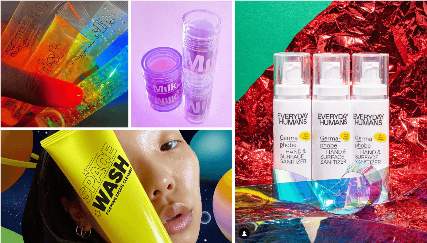
The graphic and web design in this skincare space is also interesting. Many of these brands have achieved their cult status through social media channels (esp. TikTok, Instagram and reddit), and use visual design that alludes to their innate ‘internettiness’. We find this web-based nativeness communicated through pixelated imagery, warped typography, embedded GIFs, layered backgrounds and even sound-on websites, all of which evokes a playfully knowing relationship with early-generation web design.
This commitment to artifice makes sense for brands offering a range of chemical-based products which proudly extol the virtues of safely synthetic ingredients such as AHAs (alpha hydroxy acids), BHAs (beta hydroxy acids), retinols, and PHAs (polyhydroxy acids). Our brands in focus are making an exciting and arresting virtue of their synthetic (and sometimes harshly efficacious) formulations by using a strikingly unnatural, ersatz visual aesthetic; and in doing so, are questioning the age-old idea that natural is innately ‘better’ than man-made.
2. Nobody Is In Charge
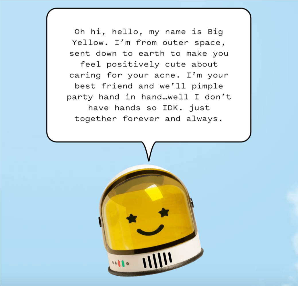
As opposed to skincare brands which hold the founder’s genius front and centre (c.f. Liz Earle, Dr Barbara Sturm, Mario Badescu), skinchaos pushes a narrative of egalitarian amateurism. For example, Starface is represented by “a spokesperson in the form of a giant, grinning, space-dwelling cosmic entity named Big Yellow.” Everyday Humans uses colloquial, phonetic language in product descriptions – “so, like, we’re here to zhoosh up your everyday routine, starting with SPF”, and InnBeauty Project states, “we taste the world through our skin, which is why we believe in your affordable skincare”. All brands utilise a conversational (and sometimes downright silly) tone of voice to keep top-down expertise at bay, and instead create a chatty, equal relationship between brand and consumer.
We also find an emphasis on invitations and joining in – Squish referring to its consumers as “the squishgang”, InnBeauty asking “are you inn?” at the close of product descriptions, and Starface calling its product portfolio “the family”. This focus on gangs and crews codes brands as a collective hub in which consumers can participate in the rituals of the family, and experience a sense of belonging. This is a fitting linguistic narrative given the brands’ collective commitment to diverse representation, and heterogenous definitions of beauty.
3. Kids in A Sweetshop
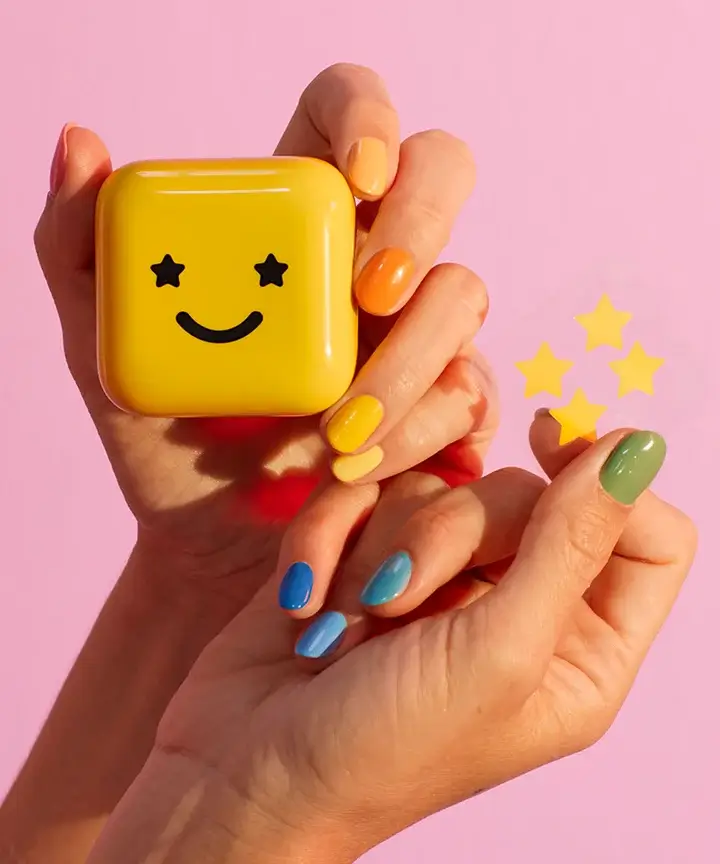
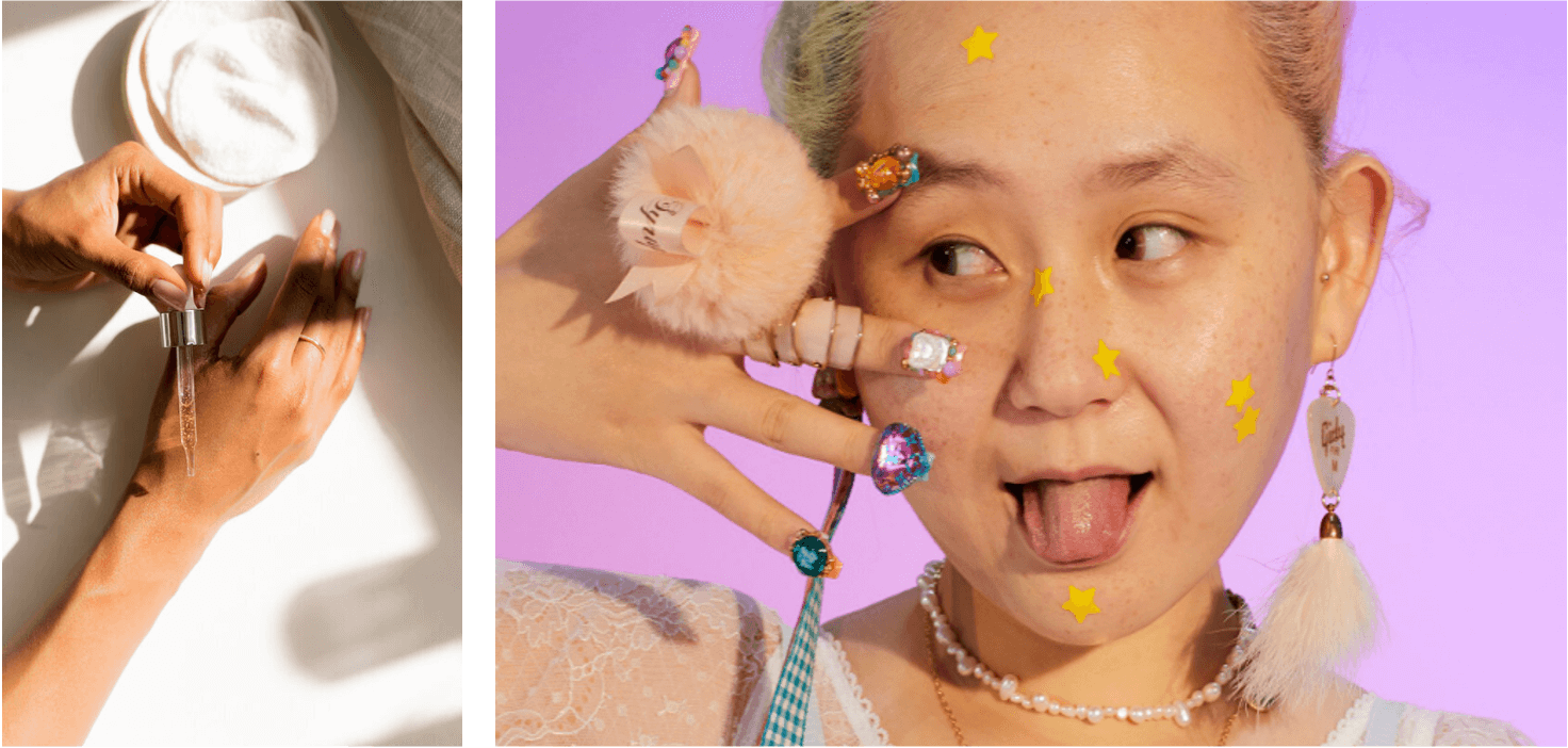
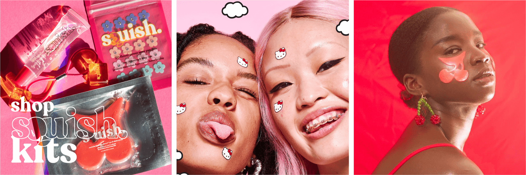
Thirdly, we find a childlike visual emphasis on kitsch novelty items and nostalgic homages to cult toys. Many of the products in this space are designed to themselves be fun and interactive – Starface and Squish sell acne treatments in the form of conspicuous stickers (stars, Hello Kitty characters, flowers) to be stuck all over the face as needed. Milk offers an iridescent refresher spray which must be first shaken to mix the two brightly-coloured oils within. And Squish’s eye and cheek masks are in the shape of enormous gummy cherries, reminiscent of Haribo sweets or those kitsch car air fresheners from the 90s. Suffice to say, these are not products designed to diminutively ‘blend in’ or make supposed imperfections invisible – instead, prioritising fun experiences and brash sensorial silliness.
InnBeauty’s neon products look like straight-up toys, an aesthetic reinforced by their skincare bundle coming in a Polly Pocket-style pink handbag. This is skincare that communicates a strong anti-serious narrative, and repeatedly encourages consumers to have fun with their beauty needs, in a topsy-turvy and appropriately chaotic way.
As we have seen, skinchaos brands are defined by a boldly graphic and artificially digital aesthetic, an egalitarian, democratic tone of voice, and a strong emphasis on playful experiences. Here are three take-outs for brands wanting to play in this space:
- Stay true to your brand identity – if you live and breathe on the internet, and sell products built from gorgeously safe, non-toxic chemicals, embrace this fact and lean in to your surreal and synthetic side.
- No need to take an instructive TOV. Speak to consumers as friends; and support them rather than teaching them.
- Consumers love a fun skincare ritual, so develop extroverted products that enable them to play. Of course, think about the environmental consequences too, and always balance fun experiences with a responsible ecological footprint.
Katharine Hill, Project Director