Our Thoughts
Sweet Semiotics Sugar free in OTC
“A spoonful of sugar helps the medicine go down” – so goes the now iconic line sung by Mary Poppins. Nevertheless, with consumers nowadays increasingly mindful of the levels of sugar in their diets and the implementation of new HFSS legislation on the horizon in the UK, the relationship between this ancient foodstuff and modern medicine is worth considering. OTC medicine brands need to consider how they are presenting the lack of sugar in their products to ensure they remain palatable in cultures which closely associate pleasant medicinal experiences with sugar or sweetness in general.
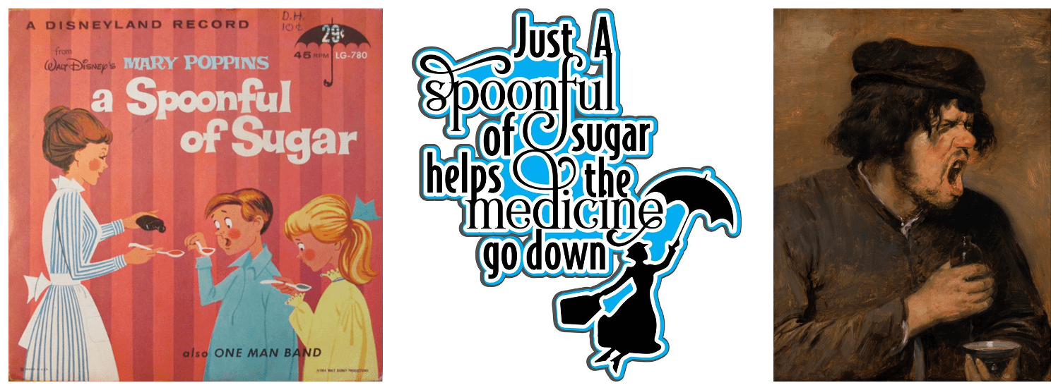
The English language has a number of metaphors which point to a cultural preoccupation with the interplay between sweetness and medicinal products. Prior to Mary Poppins, the first recorded usage of the verb ‘to sugar-coat’ dates to 1858. With the rise of the modern pharmaceutical industry and the proliferation of OTC medicines in our everyday lives, we began to use terms such as ‘a sugar-coated pill’ or ‘a bitter pill to swallow’, both implying that sweetness is a desirable quality in medicines. So how can pharmaceutical companies optimally communicate the sugar-free or low-sugar qualities of their products without compromising palatability to consumers? Below are two contrasting examples demonstrating the semiotics at play in this space.
The standard approach: Reduced Badness
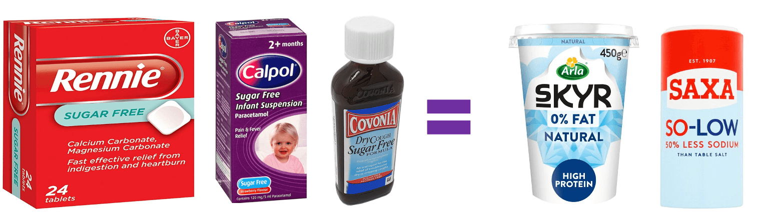
Here we can see that numerous OTC medicine brands are using light blue fonts and backgrounds on pack where sugar free is mentioned. The use of this colour is culturally associated with diet-focused, low/lower or free-from products and thus gives consumers a rapid visual association with healthiness. However, it also risks communicating drab, unpleasant flavours rather than the sweetness we desire (though note Calpol, for example, does partially resolve this by making specific reference to ‘Strawberry Flavour’ on pack). Many of the same brands also make use of red which, while being a signal of bold powerfulness and therefore of effective, fast-acting medicine, is also classically associated with the ‘watered-down’ flavour of products such as skimmed milk.
An alternative: Engaging Approachability
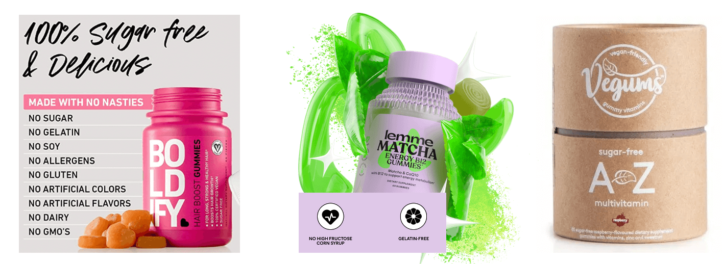
In the more emergent side of things, brands in the vitamin space are leading the way in reassuring consumers that their sugar-free products are still going to be a pleasant flavour experience by employing visual and language cues of enjoyment and approachability. Brands like Boldify, for instance, use playful text formatting and fonts, vibrant colours, language such as ‘delicious’ and candylike formats which compensate for the stated absence of sugar by suggesting a sense of robust, satisfying flavour.
Kourtney Kardashian’s Lemme line of supplements (which do contain some sugar) take a similar approach by using bright, dynamic, high-energy visuals of flavour elements, a gummy format that is virtually indistinguishable from actual sweets and accessible, emoji-like icons for talking about sugar in comms.
Sugar-free vitamin brand Vegums, for its part, uses sweeteners – a word which may cause alarm – but states that these are naturally derived and reinforces this with earthy-toned cardboard packaging, hand drawn text and leaves to convey a sense of fresh, natural flavours. The brand thus avoids the chemical artificiality or blandness that is often associated with traditional pharmaceutical products.
3 key takeouts for brands:
- Be mindful of the potential impact on desirability of using visual cues associated with diet products and counterbalance this with language or imagery on pack making reference to flavour (e.g. strawberry).
- No/low sugar doesn’t have to mean bitter or boring – use friendly and approachable language and designs for a more enjoyable pill to swallow.
- Sweeteners bring their own set of issues – if your product contains these, consider balancing out associations of dangerous artificiality by evoking a sense of naturality (e.g. through pack materials/illustrations).
Eoghain Ellis, Semiotician