Our Thoughts
Sip Into Calm Relaxation Drinks and Journeys of the Imagination
Relaxation drinks – non-alcoholic beverages with relaxation benefits – are a relatively new category enjoying success, particularly in the US. As with all new categories, it is varied – the possibilities of where this could go and what is being coded are wide-ranging. However, as a product that aims to calm the mind and take consumers on a journey of relaxation, creating a feeling of transportiveness and sensorial fantasticalness is one way to convey product benefits while tying in with emergent trends. Let’s take a look at how some brands are nuancing this, but first – a brief look at where the category has come from and how those origins are still represented:
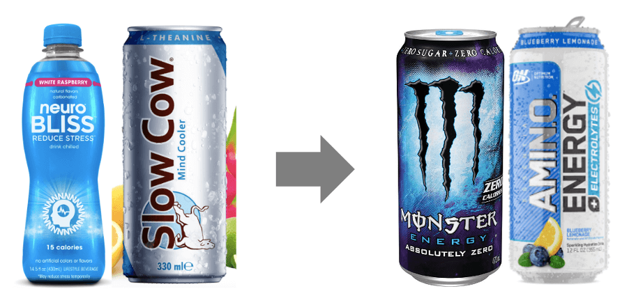
Often seen as an alternative or even antidote to the more established functional beverage option of energy drinks, some relaxation drink offerings borrow from that category or that of other performance products in terms of semiotic cues. For instance, Neuro Bliss uses strobe-like halo effect and sparkles against a bright blue, bold sans serif all-caps font and simple, quasi-scientific iconography reminiscent of products designed to support sports training, coding efficient, calculated effect.
Similarly, Slow Cow Mind Cooler, an international brand recently arrived in the UK, was originally branded as an anti-energy drink with packaging that parodied Red Bull at its inception in 2008. Although it has since moved away from that positioning, a look at the website’s FAQ section suggests the link is still present (“Is Slow Cow the opposite of an energy drink?”), backed up by a tall, narrow, shiny silver and blue can which leans more into slick functionalism than, say, craft soda poetics.
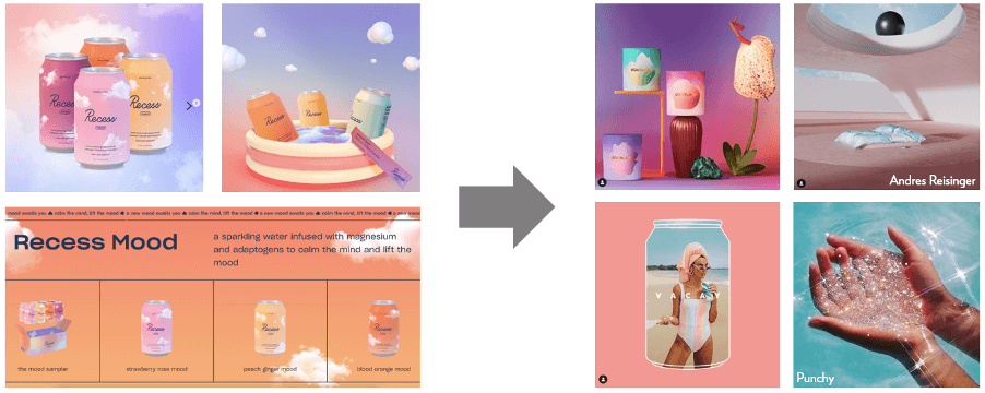
Other brands, meanwhile, are embracing more emergent trends from across the drinks category landscape and beyond. Recess, a brand heavy on the cloud imagery, often pictures their products floating in a slightly surreal, clearly computer-generated pastel gradient dreamscape, which along with a brand name that alludes to childhood downtime, codes imaginative escapism in line with the transportive, feelings-based vibes of some hard seltzer brands, the new wave of adult soft drinks, or even emergent candle offerings and the trend for digital render art. The space created is one in which consumers are the architects of their own feelings and fantastical worlds, in a way that is upbeat, playful, and light-heartedly quirky.
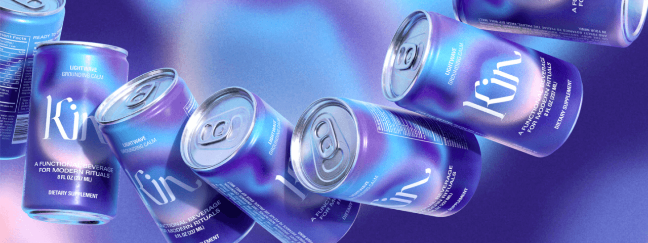
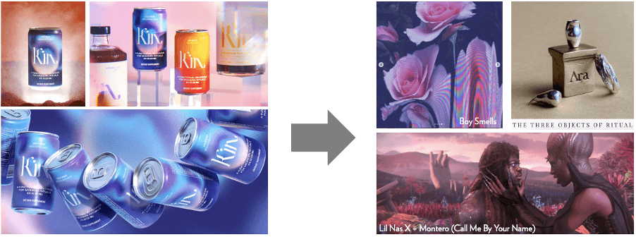
Likewise, Kin Euphorics’ new relaxation variant Lightwave is dreamlike and otherworldly, but in a less innocent, more ethereal sense that taps into a sense of ritual and spirituality – another big vibe in the emergent space (e.g. millennials still love astrology). With the tagline “A functional beverage for modern rituals” and imagery of the product raised up on plinths, Kin codes purposeful, serious occasionality of almost magical proportions. This is both amplified and tempered by the softening effect of out-of-focus edges and the use of undulating blue and purple on pack – colours associated with calm and sleep, and patterned in a way suggestive of, for instance, the Northern Lights: natural but elusive and mysterious. Front and centre of the website landing page, a moving visual of a can landing through the mist to hover above an unearthly red sand landscape suggests extra-terrestrial intrigue and the imaginative reach that comes with it. However, the setup is tangibly staged (the proportions of the grains being recognisable as dyed sand, not Mars dust) – in all, coding the feeling of imaginative transportation as both fantastical and self-aware, and positioning the drinker as in on the narrative.
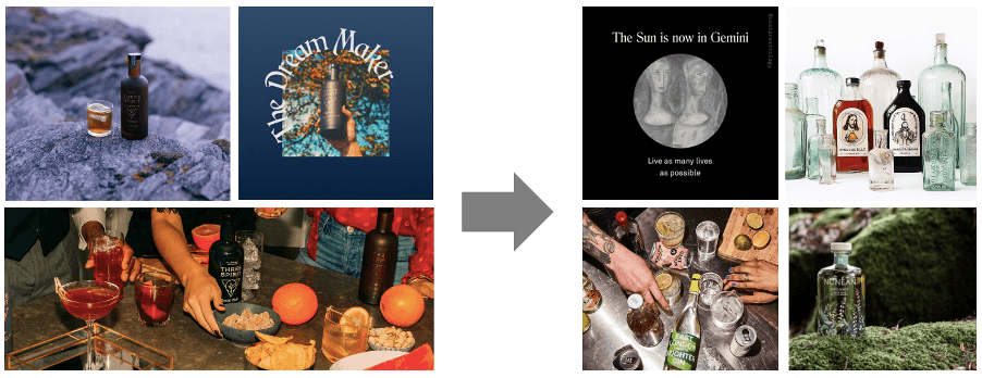
In the UK, the offer at Three Spirit, a brand that describes itself as “The functional & healthier booze alternative”, includes Nightcap, designed to relax. Cues (unsurprisingly for an alcohol alternative) are often borrowed from across the emergent drinks category. For example, the product is linked to natural ingredients via landscape imagery, coding elemental purity, and visual and linguistic references to alchemy and historical knowledge (describing the products as “elixirs”, serif font with subtly calligraphic details, composite line-drawn logo resembling a rune) code the botanical combinations as craft steeped in magic – here, transportation through time, not place. Meanwhile, imagery of the product in a social setting, amongst a candid layout of snacks and garnishes (unceremoniously whole oranges, not delicately arranged slices; reaching hands) with high-contrast but still golden indoor lighting, is suggestive of spur-of-the-moment documentation of informal memories. Though the combination of the first two with the latter may at first seem surprising, this juxtaposition codes Three Spirit and Nightcap as modern alchemy and vivid nature applicable to metropolitan life, and a modern interpretation of rituals and traditional practices that bring us together.
As we can see, it’s a feeling of imaginative but consumer-participatory conceptualisation and a sprinkling of magic that unites these emergent relaxation drinks. Here are 3 key take-outs for brands who want to tap into this mood:
- A sense of ritual and sensorial-ness (floating, movement, evocative land/dreamscapes) are powerful tools of the imagination.
- Self-awareness (here, computer-generation as an aesthetic choice or the nostalgic touch of a visibly staged product setup) brings customers into the narrative as knowing insiders.
- When creating a sense of magic, a link to the real world and how the product might authentically look in people’s lives can still be appreciated and relevant.
Sophia Lucena Phillips, Semiotician