Our Thoughts
(Re)Filled with Promise The rise of household and personal care refills
The refillables space is rapidly evolving as consumer demand for consumables with a lower environmental impact increases, and brands answer this with innovative, resource-saving formats, particularly in the household and personal care spaces. Let’s take a look at how this is playing out.
While trusted favourites such as Ecover have pioneered refillability for household and personal care products accessible via retail, newer and more premium-targeted offerings focus on providing a convenience-first approach, building-in product desirability. Simplicity, in one form or another, is often at the forefront for these brands. Tending to follow a DTC model, they move away from trips to refill containers out of home to focus on top-ups that can be delivered (often on a subscription basis) to customers who have invested in specially designed reusable packaging. This codes these brands as offering a slick, conceptual lifestyle product, not just a commodity.
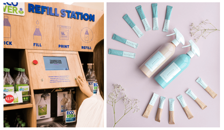
From refilling at the shops with Ecover to just adding water at home with brands like Spruce
Taking the opportunity provided by refillability and its requirement of durable, potentially higher-value reusable containers, these newer brands have created objects of use that nevertheless have lasting aesthetic appeal – a displayable emblem of both brand style and consumer commitment to sustainability. Further, the very act of always using the same – solid and decorative container positions the act of cleaning, washing, etc. as not just functional but makes caring for your body or (perhaps more unexpectedly) home part of a lifestyle ritual, again moving away from the functionality of traditional bulk refilling.
Tincture, a brand offering both household and some personal care products in refillable formats, appeals strongly to this sense of ritual, coupling it with a suggestion of ancient, natural knowledge as part of its premium proposition. Frequent mention of being “inspired by ancient monastic wisdom” suggests time-honed, careful production, with the religious overtones feeding strongly into the sense of marked occasion.
Meanwhile, as a brand name, “Tincture” alludes to traditional herbal medicine, suggesting alchemical mixing of natural substances – imbuing a sense of specialist knowledge again, and quasi-magical potential. This coding of rich, powerful naturalness expertly harnessed is heightened by imagery featuring raw natural textures, cut greenery and outdoor scenes, as well as refills packaged in dark amber glass with strong overtones of the apothecary.
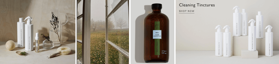
Tincture: untreated wood and cut plants, atmospheric outdoor snapshots on social media, traditionally medicinal amber glass refill bottles; minimalist bottles on a plain, neutral background
When it comes to the reusable bottles themselves however, the visual warmth of the natural elements is counterbalanced by the choice of stark white angularity and minimal design. This is echoed by the light-filled emptiness of other product imagery, and the plain, neutral-toned backgrounds of modern minimalism, coding contemporary optimisation of these old, wise ways – intuition meets science.
Similarly for hand- and body-wash brand Forgo, an upmarket minimal look (straight-sided matt glass bottles with sturdy matt metal pumps; gleaming, liminally empty surfaces) signals pared-back refinement, while natural textures and muted warm tones suggest rich plant origins. Refills delivered in paper sachets in powder form suggest purified, expertly-handled potency, while allowing customers to make their own little bit of magic by combining with water at home. Diagrams with lines pointing out key product features fit in with the minimal look and feel while drawing attention to the clearly broken-down information, coding clear simplicity.
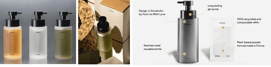 Forgo’s upmarket minimalism, natural textures and simple diagrams
Overall then, simplicity for these two brands is potent nature expertly distilled, then optimised and seamlessly delivered.
Also paring back to quality essentials, but in a brighter and more approachable way, household products by Neat use flat expanses of tertiary rich pastels as subtly tonal backgrounds on their website, showcasing the product as simple perfection as-is – no need for fussy detail. At the same time, the colour-coding effect makes for easy navigation of the product range, coding uncomplicated user-friendliness. Matter-of-fact product names and an approachable tone of voice heighten this, suggesting quiet confidence, while fragrances reference elevated ingredients in a straightforward way, again coding considered, quality choices that speak for themselves.
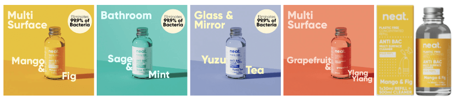
Neat’s use of colour, format and social media
This simplicity is reflected in the product name, and within that, the size of the refill format. “Neat” suggests both tidiness – of concept and of clean spaces when the product is used – and potency, reflected by the small bottle. In all, then, easy efficiency, requiring only a little of the right product chosen from an easy-to-navigate system – the kind that makes you wonder why no-one had thought of it before.
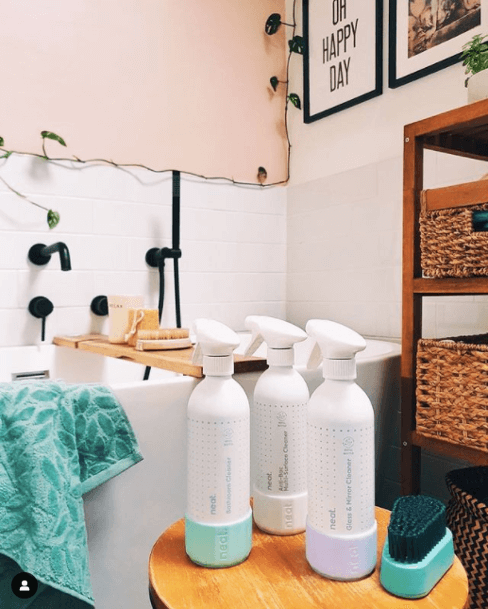
Nevertheless, a quick look at social media shows some imagery (especially more recent posts) of the product contextualised in the home. These spaces are of course aspirationally clean and tidy, but unlike with some competitors or indeed general social media home content, it’s possible to imagine they might be lived in (note, for example, the towel hanging ready over the bath), and the angles and arrangements are subtly reminiscent of consumer-generated imagery. This chimes with the brand’s approachable tone, and imagery of the product in situ codes simple integration into customers’ day-to-day.
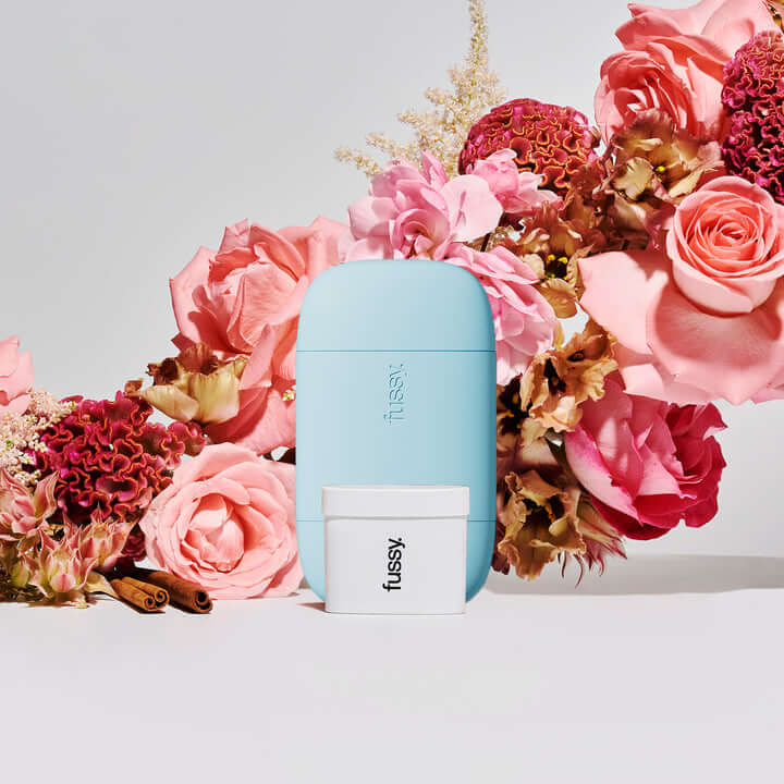
Finally, Fussy refillable deodorant (of recent Dragon’s Den fame) also functions with a simple system (single product with variations only in scent, delivered via subscription) and pared-back pack design (smooth, block-colour rounded capsule case), but uses comms and brand world to inject youthful vibrancy.

The packaging is slick and simple, and coupled with branding that communicates in a way that’s true to the internet medium
With a logo in an oval lockup reminiscent of industrial straightforwardness, but turned slightly ironic using all lower case plus a full stop, Fussy appeals to a sense of remixing and carefully-chosen fashion. This is strengthened by subtly maximalist font play on the website, a generally internet-y aesthetic, and self-referent memes, coding Fussy as in-the-know peer and participant in internet-driven lifestyle.
Meanwhile, an emphasis on the brand’s journey and status as a start-up signals freshness, innovation, and energy, positioning it as a nimble disruptor to a complex and flawed industry. This also allows for a focus on the people behind the brand as human personality, which in combination with the informal tone of voice, codes down-to-earth connection.
For these brands then, simplicity is peer-to-peer relatability coupled with products and systems that just work.
Overall, we can see that the refillable household and personal care spaces are undergoing a move towards lifestyle desirability and premiumised convenience.
3 key take-outs for brands:
- What opportunities do the way your packaging is used present? Permanent, refillable packaging can allow for the showcasing of higher build and design quality, as well as creating moments of ritual.
- Simplicity has many guises and applications, but here boils down to a streamlined experience for the consumer. How does interacting with your brand make customers feel?
- Coherence and storytelling are key to embodying a lifestyle – into what wider narratives (optimised natural knowledge? Internet-driven curation?) does your offering fit, allowing for the brand to claim relevance beyond just the product itself?
Sophia Lucena Phillips, Semiotician